The Los Angeles Times
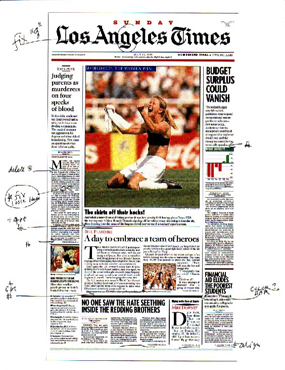
A front page sketch for the Michael Parks/John Lindsay effort in 1999.
Full image.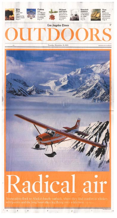
The Outdoors section was indeed radical, and a great showcase for the Berlow Kis font, LAHead Display.
 IKE Norman Mineta, who somehow served as secretary of transportation under both Clinton and Bush, it’s unusual to keep your job after a change in administrations. But as a design consultant for the Los Angeles Times, I made it through two such changes, and the design direction is still going strong.
I started working on the paper in 1998 for Michael Parks. Then there was a climatic change after the “Staples” scandal, and the Chandler family sold the whole newspaper group to the Tribune Co., which brought in the legendary John Carroll from the Baltimore Sun.
John hired Joe Hutchinson from Baltimore, and together we developed a completely new plan for the newspaper’s presentation. A full case study can be found in Contemporary Newspaper Design, edited by John Berry, and published by Mark Batty Books. A complete family of Kis types was designed by David Berlow at the Font Bureau.
These replaced the Times-like headlines the paper was using—but only in the feature sections. New nameplates (made up in Matthew Carter’s Victoria font) were put on the reorganized sections, and the old workhorse Ionic No. 5 was deployed for text.
Dashing new sections like Outdoors, and a broadsheet Sunday Calendar were launched, but we were waiting for a go ahead on the main news when John retired, rather suddenly, and moved to Harvard. His deputy, Dean Baquet, took over, and despite numerous predicitions to the contrary, Dean has maintained the newspaper’s independence (even of the White House), and continued to develop its style. And the paper keeps winning design awards. The SND gave out more than 70 prizes to the Times last week in Orlando, slight less than last year, slightly more than 2004.
I’m no longer on the payroll, but I feel confident that Dean, Joe and young luminaries like Michael Whitley, will put the whole design into place.
If you read this paper (online at least), you should realize that it often trumps the New York Times and the Wall Street Journal. Soon, the complete typographical package will make it (for at least one biased observer), one of the best designed newspapers in the world.
But that will only set it up for a new round.