Time for a redesign
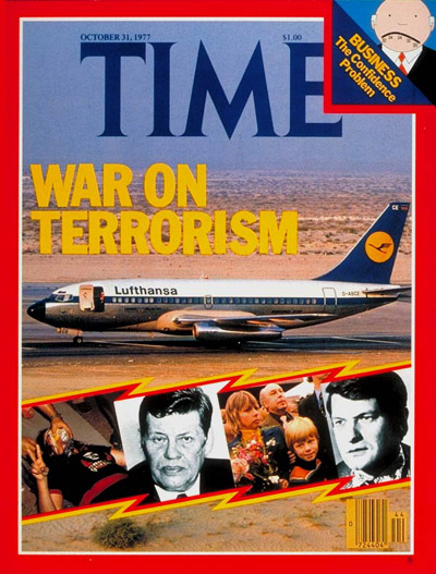
1977 Bernard redesign cover.
Full image.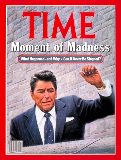
1980s Time.
Full image.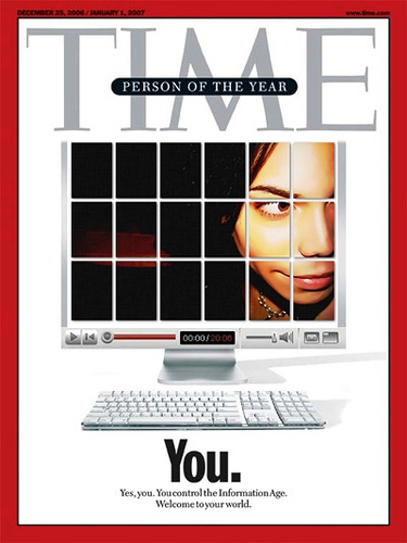
2006 Person of the Year cover.
Full image.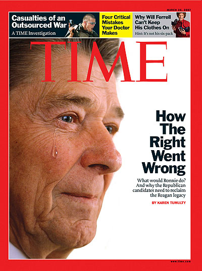
2007 Hayman redesign cover.
 AST FRIDAY, 16 March, Time
magazine appeared with a new design by Luke Hayman of Pentagram.
(Luke
talked about his on-staff redesign of New
York on this site in December, and I reviewed the
new Time.com a little later.)
AST FRIDAY, 16 March, Time
magazine appeared with a new design by Luke Hayman of Pentagram.
(Luke
talked about his on-staff redesign of New
York on this site in December, and I reviewed the
new Time.com a little later.)
I was wondering what Walter Bernard thought about the change. Walter was responsible both for the epochal redesign of Time in 1977, and for the enormously influential New York magazine, when it first appeared as a newsstand magazine ten years earlier. Trying to follow both of these acts must been a bit daunting for Luke.
In 1977 I was at Rolling Stone and I remember Folio called to ask for a quote about the Time effort, and luckily I said, “The real test of a redesign is how it works over the course of many issues.” I say “luckily” since it was only when I got to Newsweek in 1985 and tried to make a design that could compete with it that I realized how well done Walter’s work was. (I don’t even want to talk about my version of New York.)
People sometimes assume that Walter and I are arch competitors, but it has never felt that way. I’ve always respected his work, and he’s always been very friendly. I only wish there were more magazine designers in town who could do such great work over so many decades.
- - - - - - -
Your first reaction, Walter, was that the new Time is simple, and that simple is good. Is that because it is more adaptable, or what? . . .
Walter: I think it is certainly adaptable to Stengel’s new makeup of Time. I like the two-typeface system, the use of gray in the subheads, the simple labeling system. I’m not a fan of the text face, preferring more contrast in the ascenders and descenders in serif typefaces.
R: Is it still Time?
W: Hopefully it’s the appropriate Time for the 21st Century. Graphically the magazine gave up its iconic look almost 15 years ago when it abandoned telling its cover stories through personalities. I miss the inventive portrait (photo or illustration) on the cover. I really knew it was over when Madeline Albright was appointed as the first woman secretary of state and wasn’t on the Time cover.
It is a different Time. And it says its mission is different.
I made a deliberately structured design for the magazine in 1977 because there was a big production staff which needed strict rules to put out a magazine on time. Now there are trained designers on a smaller staff able to create drama on pages quickly and professionally. It will be interesting to me to see what flexibility is built into this design. I’m curious about the next several issues.
R: It’s been 30 years since your famous redesign, and of course by now you’ve “let go” of all of the changes over time, like the historical cover story. But does a designer ever really let go? And isn’t there value for a big magazine holding on to its DNA?
W: Yes. Time is trying to hold on to its DNA. Hopefully DNA doesn’t mean “Dinosaur, Not Adaptable”. I think the Franklin Gothic is a link to our design. We added Franklin and kept Times Roman. Luke has kept Franklin Gothic and added Proforma. The Briefing Section is a throwback to our page design . Even the small type contents list at the top of the opening page was in our original design, but discarded when we realized if anything changed later in the section we couldn’t go back to change the opening.
R: The logo got smaller again, and the little black rule inside the red border disappeared. Is this good? Does anyone notice these things?
W: I don’t mind the smaller logo. I’m glad it didn’t change. I never liked the black rule. It was one of those rules that should have been either a hairline or heavier than 1 point.
R: I should mention that I was hired to work on the logo in the early 90s, which you had modernized and made bolder back in the 70s. I thinned it out (with Jim Parkinson and Ann Pomeroy), made it bigger, and then restored the little black and white rules inside the red bar. But the little rules look fusty now, and I accept your point about the weight.
But, let’s talk about body type. Henry Luce, I believe, introduced Times Roman to America in the 40s. Some time ago Time switched to a “Scotch” typeface, as did Newsweek. Now it’s Proforma. What do you think?
W: I like Times Roman and I didn’t much like Miller, and like the evenness of Proforma less. I’m sure there was too much time spent on typeface studies and word count discussions. But as a reader I’ll get comfortable with this face because it is large enough and part of a clean, simple page design.
R: Over time the use of information graphics has really calmed down. Is this because every newspaper on the planet (starting with USA Today) absorbed your and Nigel Holmes’ style. Or could there be a better use of diagrams and charts in newsmagazines?
W: I think information graphics have an important role. We had a chart in almost every news story, but many were really unnecessary. I like Times “Dashboard”, with “Worldview”. They probably noticed the effective map/chart graphic in opening pages of The Week magazine. I think the newsmagazines should have more infographics on the Iraq war like the The New York Times does on occasion. A kind of chart of progress and setbacks giving us a weekly picture of the situation from casualties, to oil production, to municipal services, schools, refugees, etc.
R: What about the relationship of a print magazine to a web site with the same brand? Should they redesign Time.com again?
W: I’m not sure. My first thought is that the web site should have some reference to the magazine’s design, but the form may have it’s own needs that require some departures.
Roger, what’s your thought on the Reagan cover?
R: Well, predictably, the Photoshopped tear on Ronald Reagan’s face was criticized in the blogs as distortion reminiscent of the dark Matt Mahurin cover of O.J. Simpson. And it is being compared to covers of the Economist, as though that were a good model for Time. My own thought is this first cover smacked too much of Time’s golden era in the 80s, when you were the art director and Ronald Reagan seemed to be on the cover every week. With the dissolution of the conservative movement that Time did so much build, this cover seemed a wistful, even melancholy choice.
Ah, for the good old days! . . . . Thank you, Walter.
Your Thoughts (1 comment)
2007-03-26 by Matthew Carter
Type for Time
The body type in Time that Walter did not much like was not Miller but Caledonia, adopted in 1993 (before Miller was designed).