The last year-end post
 T’S IRONIC, BUT 2007 was the Year of Helvetica. The reason, of course, was the Gary Hustwit documentary film by the same name. I waited until September and the ATypI to see it — and wrote about it then — and now my lingering impression is the role of the great Massimo Vignelli, as a kind of Timothy Leary of modern design. Turn on, tune in, drop out. You need no more than six typefaces.
Why Helvetica? The main argument is its ubiquity, via laser printers and operating systems. Its utility is marginal. It has even disappeared from the big newspapers that used it for headlines (USA Today, The Guardian). There is a pleasant, numbing modernness about it that now evokes a bit of 50-year-mark nostalgia, in the same way that the egregious row of office towers on Sixth Avenue (developed in the 60s as an extension to the wonderful Rockefeller Center) today look agreeably mid-century modern.
You can now buy the Helvetica DVD from Amazon.
Clearview
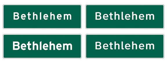
The new Helvetica is Clearview, which is like saying, as they do in the magazine business, that the new “up” is “flat.” I missed blogging on The New York Times Magazine picture story this summer which showed in surprising detail the development and implementation of this new design for highway signs. The Times completely bought the argument that this is a big improvement, but (as with many things in that magazine) it is really a matter of style.
The Clearview team, Don Meeker and James Montalbano, follow the Humanist orthodoxy laid down Alfred Edward Johnston, who was responsible for the lettering of the London Underground, the granddaddy of all modern transportation graphic systems (also discussed in that ATypI post).
The new font replaces the vernacular “Highway Gothic,” which Tobias Frere-Jones adapted as Interstate. The real question about these styles is the style question. Do you go with the Johnston broad-edged orthodoxy, or go with James Mosely in the love of the somewhat tougher, built-up lettering?
Functionally, Clearview is not the clear winner. There are a few Johnstonian design elements, such as the little tail on the bottom of the lower-case “l” that may enhance readability. Counters are bigger, as the team put to work some worthwhile observations about the spread caused by the reflection of the sign material. The results were shown by the Times in the magazine, and as an interesting slide show on the web. However, as a five-minute Illustrator study indicates, the legibility of signs is more a matter of size and spacing than the difference in design.
Design equity
I share with Mosely, Benguiat, Parkinson and Downer a love of the expressive letterforms that exploded on the scene with the commercialization of printing during the Industrial Revolution. The sweet chancery or foundational script, preached by Johnston as the Mother of All Letterforms, is a wonderful thing, and the style has infused the work of great designers from Zapf to Unger. I was lucky enough to learn the chancery gospel as a child from Paul Standard, the American apostle of the movement. Yet, there are a lot of magnificent typefaces out there that have nothing to do with it.
And I just plain like the Interstate style, which is derived from old American sign-painting rather type or calligraphy. It’s a matter of taste, or if you will, religion.
There is something else at work here: nostalgia. I’ve remarked before that nostalgia is a function of the human assumption that the way things were when we first noticed them is the way they are supposed to be.
Thus, there is a momentum or inertia in a successfully deployed style over many years, like the Interstate highway fonts. Of course most drivers won’t notice when the signs change to Clearview. But I would have stuck with Highway Gothic on the grounds that is is so familiar, that it has a long history, and that it works (if indeed it could be made to work better).
It has design equity in its favor, like the Ludlow Bookman which The New York Times chucked in favor of a new, soft and vaguely Presbyterian Cheltenham. (The original Cheltenham, with its absurdly high-hat ascenders, was Episcopalian, like many of the churches built by its designer, Bertram Goodhue.) Why change? Tom Bodkin, the Times’ AME for design, would argue that the move to Cheltenham was made to unify the paper’s design equity, which contained a lot of Cheltenham. (Others would say that the front page’s Latin Elongated was an equally key component.) So this may be a matter of style, too. I just would have gone with the Bookman.
In 2007 we saw font changes as a result of redesigns at Time and Newsweek, also blogged about here. I miss Time’s Times Roman, despite the fact the font is as generic as Helvetica, for the same reasons. (Can you remember the 1970’s design of Communication Arts, which used Times Roman throughout as an expression of good contemporary design?)
Time was one of the first magazines to use the typeface, following the lead of its sister magazine, Fortune. (I imagine that Henry Luce was the first importer of Times New Roman, right after World War II. Perhaps he was the reason Linotype was able to get a license to the design.) With this much design equity, why change the body type to Proforma? Instead, why not get Petr van Bloklund to do a rethink of Times?
Later in the year Newsweek arrived with a new design, which, partly due to my own influence, was more familiar. Amid Capeci, the art director, switched backed to a Bureau Grot — from Knockout (aka Champion), Hoefler’s fine series done for Sports Illustrated, and inspired by the same 19th century wood types that Jerry Smokler used for all those great CBS Records covers in the 60s). It was a grot, too, and both changes may have escaped many readers.
Newsweek’s art director in the early 00s, Lynn Staley, had tired of the Stephenson Blake-derived Grotesques which I had started installing in 1985, in part because they had become over-familiar and dated. The problem with the Champions is that not only S.I. had put them in, but so did Forbes and a number of monthlies. Newsweek looked fresher, although more generic, and soon as the style ebbed, it was just as dated.
Nowadays grots are less ubiquitous, and by interpolating a new width (lighter and more condensed than the original Newsweek No. 9 by Parkinson) the magazine got a fresh look, somehow more like Newsweek than the previous design. At least to me.
In December a new design appeared for Reader’s Digest, where I tried to invoke the equity of the Bradbury Thompson design of the 60s. That effort, with the Granjon fonts and Big Caslon, did what it set out to, but editorially the magazine did find a younger audience. It may be that the nostalgic redesign was the wrong signal, and new editor Jackie Leo was brought in a few years later to rethink it.
The logo (which Parkinson had restored from the Thompson era) was gone over with a ball-peen hammer, and the interior design, including the great use of illustration directed by James McMullan himself, was brought way down market.
Leo’s efforts, if anything, failed worse, and a new design has now been ushered in just as she was pushed out the back door. A new logo has an emphasized “Digest,” like that’s the good part. The interior, designed by Hannu Laakso, the staff art director who came in when I was working on the project more than ten years ago, is energetic and well-paced, but is it the Reader’s Digest anymore?
This design equity thing is clearly mixed with nostalgia. Yet as magazines and newspapers continue on the glide path to oblivion, they seem more and more desperate to do redesigns that throw away their past. This, just as us old Boomers have more money and more time than ever.
I guess that the Digest was afraid that all the people who loved the old magazine are dying or that they may be already dead. It’s been a long time since the magazine had the zing and utility of the days when the idea was that this was the magazine to read if you could read only one. Why wouldn’t that work today, when people have even less time on their hands, and much more media? Maybe the new editor will channel DeWitt Wallace.
Certainly Adam Moss at New York is channeling Clay Felker with great success. The magazine has never seemed more up-to-date, and its web site has come alive. And Jon Meacham at Newsweek is channelling Oz Elliot (with a whiff of Parker, as Maynard would say), just as David Remnick is channeling Harold Ross at The New Yorker.
Reading
The New Yorker, in its year-end issue, ran a thoughtful and sobering essay by Caleb Crain, “Twilight of the Books.” I have been arguing that the circulation problem with publications is not just the Internet, it’s a combination of social changes. When the news is not catastrophic, when survival is seldom on our minds, people are not compelled to read newspapers. When one’s social sphere is more interesting than events in Pakistan, then you get MySpace and FaceBook, instead of Time.
I’ve been hoping that if the printed media provided richer narratives, their fortunes might improve. People love stories, and writing and reading is a direct and economical way to exchange them. But now Crain comes along with evidence that MacLuhan’s Post-Literacy is upon us. People are reading less, and are less able to read. YouTube is a leading indication of narratives moving toward the visual, and Crain argues that the non-literates actually think differently than literate ones. (This may be different with post-literates than it is with pre-litereates. We just don’t know yet.) If you extend his line of thinking, video voicemail will replace e-mail, and audio or video blogs will replace the text kind.
Crain suggests that those of us who love reading will end up being a kind of antique crafts group, or a bridge club, with none of the social caché that literacy gave readers in the Middle Ages. This unwelcome marginalization of reading, even if those of us in the margin were considered to be an elite, is much more frightening than the decline in the market cap of media companies. Indeed, if the kind of intelligent discourse required in a democracy were relegated to an “elite,” we would be in big trouble as a society. Worse, if enough people think “the news just comes to” them and that their opinion and their vote have no consequence, our whole political system could be taken over by a despot.
Once again I may be suffering from the nostalgia thing, and think writing is the best narrative form since that was the way when I got here. Nevertheless there are counter trends to what Crain contends: The Internet is distributing more text than anyone thought possible, and engendering more. They say there are 70 million blogs now, which sure beats Mao’s “Let a hundred flowers bloom.” Text messaging may keep people writing, even if they never mail a first-class letter. And despite all the technology improvements that makes it possible for a movie to be made by a crew of one, motion pictures still take a lot more time to produce than a written story, and time is something we are short. And lack of time must be a big reason for the decrease in reading.
Crain, what is more, is talking about passive media. A major benefit of the Web is the commentary — the fact that you can comment on the text — or on the video. Sometimes the comments add up to more than the blog. The extremely focussed, interactive side of the Internet may extend the life of writing and reading past the time when people have stopped reading potboiler bestsellers. Instead of being defined as producers or consumers, we may be coming to a media market where everyone is doing a little of both.
Resolution
This blog kind of trailed off in 2007, and I promise to get it going again in the New Year, along with exercising more, dieting, and being an all-around nicer guy. . . .
And clearly I have to start video-blogging.
Your Thoughts (4 comments)
2008-01-01 by Antonio Cavedoni
Edward
Of course the man responsible for the London Underground lettering was Edward Johnston. Alfred is probably Alfred Fairbank, another noted english calligrapher?
2008-01-01 by Roger
Oh
For some reason I have a block on Edward Johnston's name. Maybe he seems more like an Alfred to me . . . But thanks for the quick correction. And, Happy New Year!
2008-01-28 by Dorian
Post Literacy or New Literacy
Roger, I'm glad your grump about the lack of reading turned into a more philosophical look at whether we're entering a post-literate phase of commenting and writing. I would ask if there's even a newer form of literacy, one that deals with images, sound, moving images and the like -- yes, it takes a lot to do a feature film, but never before has it been as easy, more easy, to shoot a little video and share it than it is to write. I probably could have said all this into my computer's built-in camera and uploaded it to YouTube in the time it took me to compose this. Not that the speaking (or the thinking) could have been as clear. But it is a new kind of "literacy." Perhaps.
2009-02-23 by rob
White on red?!
Are you insane?! Your site is unreadble. Go back to school.