It’s still the Journal
A close-up of the Journal’s new body type, with a label-heavy summary box.
Full image.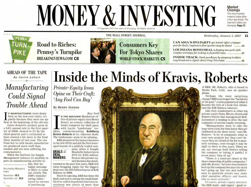
The top of the Money section front, with a whole lot of different fonts.
Full image.
The new A1, day one.
Full image.
The new A1, day three.
 UESDAY morning I opened the door, and in front of the apartment across the hall was a copy of the Wall Street Journal. My own was buried beneath The New York Times and the Financial Times, and I had to get the papers onto the kitchen table before I realized that the Journal had changed. It was smaller; less than a foot wide. Last week it would have stuck out of the stack.
For Dow Jones the important thing is that when you see the paper by itself, it still looks like the Journal. When a newspaper has so much design equity, it’s crazy to change it beyond recognition. They had carefully intensified the classic look and feel a few years back, adding much richer typography, including a fine series of Scotch headline typefaces from Cyrus Highsmith of the Font Bureau.
The previous redesign was done by the marathon runner, Mario Garcia, working with the staff design chief, Joe Dizney, who has since, unaccountably, left the paper. Last year, Mario trimmed their foreign editions to tabloid size, and the reception was lukewarm. It may be that broadsheet typography just doesn’t work in a tab. Or it may be that European and Asian editions of U.S. publications are mooted by the web.
Now Mario is back on the U.S. edition, and it all seems to work. Of course, whatever you think of this effort, anyone who has worked at big daily paper (never mind one that has a whole newsroom just for the front page) knows that a newspaper redesign is a group effort, and the designer is more of a catalyst than a visual artist. Mario is a persuasive kind of guy, but you don't just wave your wand at the Wall Street Journal.
This skinny broadsheet is like a tall tabloid, what people in the business call 48-inch—for the width of the roll of paper on the press. The decision to reduce cost by shrinking the page size was made about two years ago, and since then the editors have thought long and hard about the impact of such a move.
They had to shave a column off every page. On page one, this would seem to mean losing the space for the off-beat feature. Nevertheless, on the first day,they did fit in a soft story on Gerald Ford’s boyhood home in Grand Rapids, which has been restored by a couple named Tim and Rob. (The interesting thing about this piece is that it just took for granted that the owners are gay.)
Cutting the news hole in this big newspaper is good for the readers, if the editing gets tighter. Paul Steiger, the managing editor, explained in an early-warning message a few months ago and again in a first-day section titled, “Reader’s Guide,” that they are doing more than just condensing the content. They’re shifting their overall emphasis toward more in-depth journalism with “a strong forward pitch.” This assumes that everyone gets breaking news elsewhere. It’s a pity that it is taking newsroom executives so long to figure this out. Tom Wolfe, Hunter Thompson and other “new journalists” were doing this in magazines 30 years ago.
Newspapers, like magazines, broadcast TV and the music business, are reluctant to blame their falling market caps on the quality of their products. But I think newspapers would be in trouble even if the Internet never happened—because they don’t print what most people would be interested to learn.
What is news, again?
My definition of news is “interesting, useful stuff that you hadn’t heard about.” The reason people are deserting newspapers is that they are boring. They mostly run stuff that is not new or not interesting, or both. This includes the stock listings, which now even the Journal has pruned.
Of course you can get virtually all the text from newspapers on the web, but you miss the layout—the sequence, juxtaposition, and the occasional surprise. The layout of the newspaper is a form of news judgement. You don’t get that with a Google search, or at an aggregated news site like Yahoo! News.
So the news about the Wall Street Journal is not the new size, it’s their new definition of news. The result is a more analytical, reflective, refined and dense newspaper. Redesigns should be judged over time, but my first impression is that the Journal is more interesting.
It is also more controlled. What most first-day bloggers and columnists missed, is the carefully moderated attention the paper now gives to the inside pages. The old composing-room randomness is gone. Backward jumps are banned, along with internal jumps. So, too, are the fillers. Instead, we have more short “briefs” columns. There is more attention to navigation. There is better sign-posting and more orderly jumping. There are more summaries.
All of this should be good, but one objection to the new design might be that it is too controlled. Navigation can submerge content. For example, the summary boxes all look alike, with headings that say “In Summary”. Each has three items with bold lead-ins: “The News”, “What’s at Stake”, “The Bottom Line”.
Or, at the bottom of each briefs box, the reefer headings are more prominent than the content. For example, on the “Politics & Economy” opener, there is a header, “MORE” and then, “The Economy,” “U.S. Politics” and “International”. Is that more useful than small kickers for the subject, and bold headlines for each item? (And, while we’re quibbling, why have colons after the subjects?)
I expect that this will loosen up over time, and a bit more randomness will creep in. And you gotta love the modular presentation of the ads. (But I hated the checkerboard layout on the Day One back page of Marketplace, which put an ad above the news. Ye gods!)
At the micro level of the body type, there was also a change. A new Hoefler-Frere-Jones text face was introduced, which people won’t notice, except for the cranky letter-writers who complains about illegible text after a redesign, even if you don't change the type.
This new font, Exchange, does seems a bit clearer than the old Dow Text, and the bold works brilliantly. This is important, considering that company names are often put in bold in running text, and they start off each line in the front-page “What’s New” index.
My criticism is that it is not a stylistic match for the Cyrus’s Scotch headlines. The new font is more like Clearface with little whiff of Caledonia, or is it Gulliver? (Do you think Tobias saw Christian Schwartz’s new Guardian body type, or is Dwiggins just in the air?)
In any case, I beg the Journal to stop varying the tracking in justification. This type needs even letterspacing.
Type nits
- Drop initials don’t align very well.
- Some headings are set in a wacked-out expanded modern, clearly a mistake.
- One-reporter bylines often don’t fit on one line.
The occasional sans-serif labels, now set in the Tobias Frere-Jones agate font, Retina, seem bland and weak, compared to the the Franklin Gothic, previously in place. Newspaper designers now favor whole families of one typeface, rather than an eclectic collection. So both the Journal and the Times have abandoned Franklin Gothic, which means this great American type is available again!
The only really bad thing about the whole effort are the skybox windows, or whatever they may call them, tinted though they may be with some interesting colors. The front page, particularly, would look vastly better without the reefers. The text, soon if not already invisible, won’t sell a copy. And for navigation, they are redundant. But I have as many quibbles with my own work and my own clients. For the first three days out of the gate, this is a superb job. A handsome, elegant, logical step for a great newspaper that signals an editorial course change in exactly the right direction.
- - - - - - - - -
Note to the Journal Copy Desk: If the brass insists on keeping the skyboxes, you can do better than, “Road to Riches: Pennsy’s Turnpike.” Look at any one of Bloomberg’s 5,000 daily headlines. They tell the story and its impact. In 73 characters.
Your Thoughts (1 comment)
2007-01-08 by Brian
In deinal
"...are reluctant to blame their falling market caps on the quality of their products." Working for a media group in Ohio I have experience with newspaper, television, and radio and I must give you a big "huzzah" for hitting the nail on the head. I work in the web department - creatively dubbed "new media" - and no matter how hard I try, it seems extremely hard to convince people that the product is probably what is off kilter, not the medium (of the web). I continually state that you can't run a web site like a television station (or radio station...or newspaper). If the organization would focus more on what they actually do, i.e. news, then the delivery would take care of itself. Just the other night after hearing a story on NPR about the "future of movie downloads", my wife pointed out that it seems funny that the movie (and music) industry aren't blaming poor sales on crappy products. With movie/music prices going up the consumer has a right to expect a better product, and whe that doesn't happen - obviously they don't return. Despite it being entertainment and not news, it makes the same point. Aside, this is my first visit to your site and will certainly return. You have a good look and good writing - focusing on what you actually do - a novel idea. Cheers.