Vertical storytelling
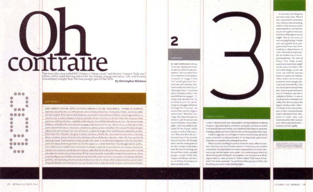
Details spread.
Full image.
Details cover.
Full image.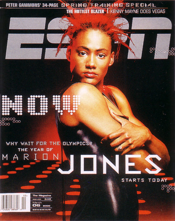
ESPN cover.
Full image.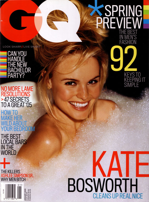
GQ cover.
Full image.
GQ spread.
Full image.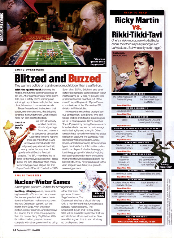
Maxim articles.
Full image.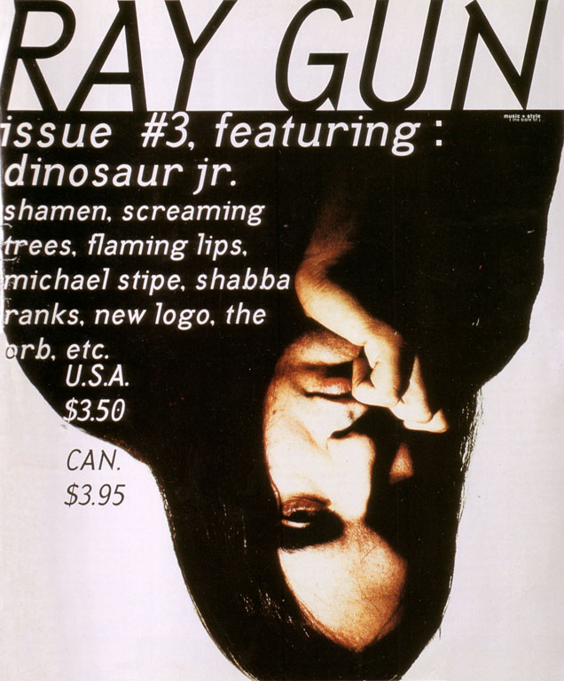
Raygun cover.
Full image.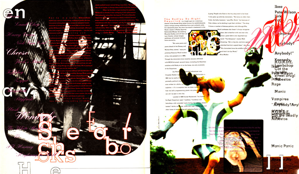
Raygun spread.
Full image.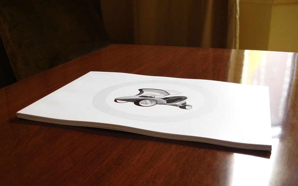
Rove.
Full image.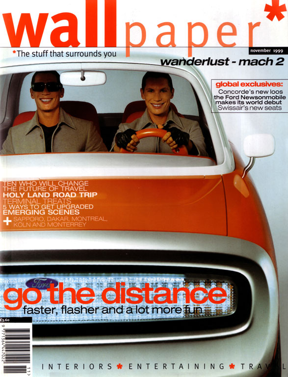
Wallpaper cover.
 HIS presentation started as a 10-year design review for Magazine World.
The only trend my colleague, Robb Rice, and I found, is that there is no trend.
Design Directions
In the 60s we had Esquire, in the 70s, Rolling Stone, in the 80s, The Face, in the 90s we started with Raygun. Then something happened. Magazine art directors, who heretofore had traveled in a large pack, began to wander off in small groups. As with other areas of pop culture (e.g. music), the era of the superstar and the unifying trend was over.
In 1994 we were still under the influence of David Carson and the use of distressed type — and even dummy type. Photoshop effects and deconstructed graphics were pervasive. Even mainstream magazines (Entertainment Weekly, Men's Journal, GQ, Premiere, and US) were overlapping Grotesque typefaces to happy abandon. The experimental look was everywhere. Maybe that was what killed it. Once Nike, MTV et al picked up the style, a self-respecting editorial designer had to do something else.
Wallpaper, in 1996, struck a new note: minimalism. Clean lines and white space came in like Neville Brody's neo-modern Arena after his neo-Baroque The Face. Detractors found the style cold and stiff, but the effect was bracing after the tattered look of early ’90s. And the whole culture was moving toward more diversity.
1998 was the Year of Design. Consumers began to favor design-conscious products at Ikea and Target. Martha Stewart created products for K-Mart. The new Volkswagen beetle took off. Art directors moved up a notch on magazine mastheads, and magazines were streamlined. EPSN and InStyle were crisp successes. Maxim created a stir with “charticles,” a feverishly busy front-of-the-book, short and plentiful sidebars) and a new emphasis on the newsstand.
Newsstand sales began to hypnotize publishers, as magazines blamed the web and the proliferation of TV for declining market share. The tabloid look, lead by Bonnie Fuller at Us Weekly, affected almost all women's magazines, at least as far as the cover. Putting numbers in cover heads (“101 tricks to lose weight”) worked for her, so all women's magazines put numbers on their covers. Similarly color-filled circles appeared on the covers of US Weekly, InTouch, People, and Star.
There were countervailing exceptions: Martha Stewart Living, first tested in 1990, followed by Real Simple in 2000. That year, Details followed up with a startlingly bold and simple redesign, which became the darling of young art directors in the States.
In 2002, Fred Woodward started redesigning GQ with a startlingly bold and simple style — every three issues. GQ, took a cue from MTV: avoid going stale by updating frequently. Some magazines, like Rolling Stone and the influential New York Times Magazine, have held their design steady, but their consistency just adds to to the overall eclecticism of our era. We know now that the trend is "No Trend."
Ten years ago we had wildly experimental type and graphics. Then we went clean, and now we are moving towards layered and decorated pages. As magazines flood the racks, creating a wholly unique graphic style is important to stand apart to connect with readers.
As media competition intensifies, and people find many better things to do than reading magazines, there are shorter and shorter word counts and more intense subjects. It’s surely true in the big women's magazines, such as Good Housekeeping and Glamour, and it’s true for Maxim, ESPN, Blender and GQ.
High and Low
There may be no unifying trend, but there is movement. With everything speeding up, perhaps the Weekly is the future. UK publishers are leading the way here. With fashion, entertainment, and celebrity gossip changing so quickly, and with the web’s ability to do instant updates, maybe monthlies will have to go weekly to keep up with readers, and hold them among so many activities and influences.
And with everything on the Web and TV getting shorter and shorter, maybe there is a future for magazines with compelling narratives, either in text or pictures.
It's not so much a matter of high vs. low as narrow vs. broad. The combination of globalization and diversity makes it increasingly difficult to produce mass media, and less and less likely that anyone wants them.
The vertical magazines of the past are looking very "general interest" today. That's because people are looking for their own communities. Magazines have always been a better medium than TV for narrow.
And they're a much better medium than the Web for narrative.
One good narrow example is Rove, a magazine/web site startup directed at high-end automobile collectors.
With very high production values, and a very small audience, Rove must move beyond the traditional CPM-based economy of a magazine (and the Google/keyword advertising of web sites).
Instead the magazine creates its own narrative by actually commissioning an automobile design each issue from a big-name artist or designer—outside of Detroit and Stuttgart. Then Rove sells limited edition prints of the design—as well as 1:9 scale models, and even full-size prototypes.
Rove’s web site is building an online community, and plans to provide car auction data and news for subscribers.
The No. 0 prototype issue commissioned the "starchitect" Zaha Hadid, who produced an environmentally friendly "trike" for the magazine. When the Guggenheim Museum found out about the project, a full-scale model was included in the big Zaha retrospective show this summer.
* * *
Narrative intensity and a self-identified readership can make a successful traditional publishing venture. But in today’s rapidly shifting culture, a media narrative is like a classical myth. It improves as it is passed around. The web site can close the loop. And editors and publishers can build a stronger relationship with their communities than just selling them magazines.
Your Thoughts (1 comment)
2006-11-17 by Dale Cruse
I saw that Hadid installation at the Guggenheim this summer. I found it interesting that much of her work existed in sketch and scale model only - not actual buildings.