Out of Time
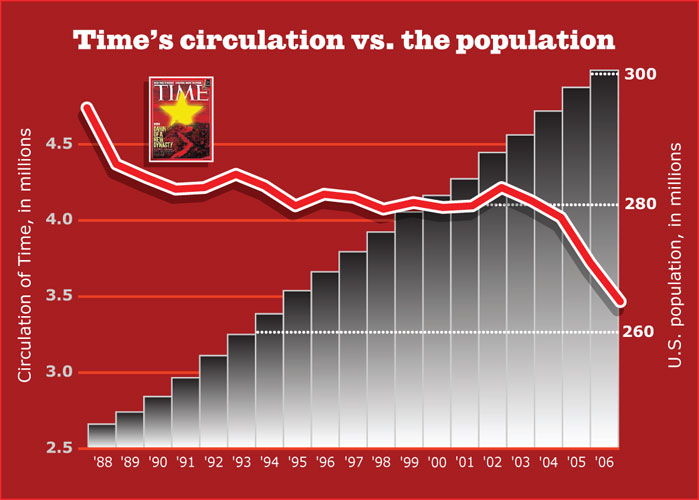
RogerBlack.com graphic by Scott MacNeill (www.macneillandmacintosh.com). Sources: Stateofthenewsmedia.com, United States Census Bureau
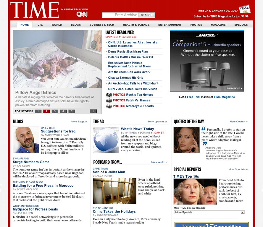
The new Time.com.
 N THE DAY last week when Time.com’s redesign appeared, I was having lunch with a young magazine designer with a live interest in online media, a combination that is getting less rare. This guy is a survivor of Giant and Shock (if he applies to work on your magazine, watch out), and he asked me what I would do with Time. My first response was that if they held a gun to my head and told me they would pull the trigger if I didn’t come up with an editorial strategy for the leading newsmagazine, I would say, “Go ahead and shoot.”
Newsmagazines have been repeatedly crowded to the edge of the cliff. When television news and the big metro newspapers started doing news summaries and round-ups, Time and Newsweek turned to trend spotting. I remember Rick Smith saying when we were redesigning Newsweek in 1985, “We can’t just do the ‘tick-tock.’”
As newspapers and TV channels took on lifestyle reporting and daily news analyses, the newsmagazines have had to peer with more concentration into the future. The print magazine, Time, is now published on Fridays instead of Mondays, and Richard Stengel, Time’s new managing editor, explained the content changes this way:
“The traditional newsmagazine was retrospective, looking back at the what happened the previous week. But today’s Time is much more forward looking, offering you guidance on what's essential to know going forward. Many news sources give you information; we provide knowledge and meaning.”
To some degree, this means more opinion and a little more surprise. Stengel has signed up historian Niall Ferguson to greater perspective. And they’ve reinstated the Law section, and there is a promise of more changes with a redesign by Pentagram’s Paula Scher and Luke Hayman sometime this year.
Opinion used to pervade Time, and the slow dilution of its staunchly conservative Lucian line, along with the magazine’s trademark locutions and inverted grammar, have made it fairly flat. David Carr, in his Jan. 8 column in the Times, decried its cheap production values. As “a thin weekly on increasingly thin paper, Time magazine is not much of a thing to behold,” he said.
This is a good point, but more telling is a simple comparison of Time's circulation vs. population growth. (See first image.)
When Life, at seven million circulation, was a mass magazine, Time, at 4.5, was considered a special interest title. Now it’s one of the biggest, and compared to some other large mammalian survivors like Reader’s Digest or TV Guide, has held it’s circulation despite the competition of TV, cable and the Internet. But, as an anonymous executive was quoted Monday in the New York Times: “Flat is the new up.”
Back in the mid-80s (when I was working in the newsweekly trenches) some three percent of American men, women and children subscribed to Time. They paid for it! Now, with a 20 percent circ. cut made to richen the demo, it’s closer to one percent. But, hey, that beats the combined prime-time audience of all of the cable news channels by 25 percent! (Stateofthenewsmedia.com) It’s something like a third more than the number of uniques CNN.com gets in a week. (Quantcast.com). And in any case, Time’s marketing department talks about a 19.5 million audience, not circulation. (They quote the MPA’s Jack Kliger “Circulation-based metrics are irrelevant in calculating advertising return on investment.”)
Time’s change to Friday may not do that much to help. (In St. Pete Beach, copies hadn’t reached my local Publix by Monday morning.) More to the point may be the sense of calm seriousness about the magazine’s editorial presentation. It ain’t the Economist, but who among us is that smart and has that much time? It sure beats Newsweek, which got a little goofy-looking after the sad death of Maynard “scramble-the-jets” Parker. (Newsweek has a new editor, too, Jim Meacham, who is bringing back Amid Capeci, and it looks like we might get a bit of a horse race.)
Like the arctic ice cap, the historical market penetration these weeklies had, is not coming back any time soon. Their only real option is to push further online. Like many magazines, they were a bit tentative at the start. Newsweek hooked up with MSNBC, and is still there. It can’t be that bad, since they claim some 8 million unique visitors a month. (They rank below Time in the Google News links, according to Newsknife.com.) But it’s weird in a day when everyone can have their own vanity-plate URL, not to see “Newsweek.com” on the top of the browser.
Time, trapped in a decade of deals with AOL, finally broke free last week. They’re still holding hands with CNN (which helps the frequency, although you leave the site to follow the links). But, Time.com is in the URL line. The blogs have now come forward. There are a dozen of them now, with a few promoted on the home page.
As a slow blogger, a slogger, I continue to be astonished by Andrew Sullivan, who must have shredded finger tips from constant text entry. And talk about opinion. Sullivan makes Luce look a wuss. The cluster of blogs is now about a dozen, and they’re promoted on the home page. Most have a new, clearer design (see Joe Klein, whose “Swampland” is like having a political macher at your side 24/7) . Next they ought to pair two opposites, like the old debate on 60 Minutes between James J. Kilpatrick and Shana “you-miserable-slut” Alexander. What’s happening with the blogs is that the readers are getting involved with Time in a real way. And it turns out, they are not that dumb.
There is another kind of blog, The Ag, or The Aggregator, which Matthew Yeomans writes five days a week as a daily news synopsis like they used to do for Ronald Reagan. This is similar to Today’s Papers in Slate, but focuses on only three or four top stories, and goes more online, so it doesn’t worry about the varying news judgement in the different newsrooms. Both are a bit long, and neither come complete as e-mail newsletters. (Don’t know yet when something big happens on the weekend.)
A better design
One imagines that, with a Paula Scher/Luke Hayman redesign in the works at the print magazine, there will be more changes, but this new look is big improvement, particularly on the landing pages, which have simpler ad layouts, and really promote reading if that’s what you want to do.
The pictures, on the other hand are presented without much innovation. A rather dry slide show viewer holds the pictures of the week. What’s needed on news sites right now is a breakthrough for photo layouts.
There was an attempt to break out on the home page. On the top left, in the key position, the site offers the six or so top stories, in sequence. Shades of MSNBC.com 1997! We called it the “center stage.” The problem with our try was that it was on “auto-start” and that annoyed people.
The usability folks probably told Time to make it user controlled, but you tend to just sit there and wait. Even when you figure out you have to push the button, it’s slow, and the numbers at the bottom are not captioned, so if you want to go back and find something, you have to go through them all again. And why isn’t video.
This effort reminds me also of the modal, layered tabs of the Boston.com center-stage, which we foolishly copied for chron.com. The users in Houston couldn’t figure it out, so they dropped it. I guess they have more patience in Boston.
But patience is in short supply on the web. Users want content on the surface, not a bunch of teases.
I will not inveigh here again about headline-writing, but the copy desk at Time may have been thinned out too much. On opening day, I copied the headline stack from Time.com and from Bloomberg.com. I present the two without further comment.
- CNN: U.S. Launches Airstrikes at al Qaeda in Somalia
- Dems Resist Bush Iraq Plan
- Belarus Battles Russia Over Oil
- Exclusive: Bush Picks a Replacement for Harriet Miers
- Are the Stem Cell Wars Over?
- Chavez Extends His Grip
- An Archbishop Falls to a Witch-hunt
- CNN Video: Gates Touts His Vision
- PHOTOS Rock’s Top Honors
- PHOTOS Fatah Vs. Hamas
- PHOTOS Motorcycle Escorts
- Oil Drops to Lowest Since 2005 on Warm U.S. Weather, Increased Inventories
- Venezuelan Bonds Decline for Second Day on Chavez’s Nationalization Plans
- U.S. Stock-Index Futures Rise as Oil Tumbles; GE, Alcoa Shares Advance
- Sprint Shares May Fall After 2007 Sales Forecast Misses Analyst Estimates
- Hedge-Fund Borrowing, Margins Examined by SEC, Fed, European Authorities
- GE May Sell Plastics Unit for as Much as $10 Billion, People Familiar Say
- BP’s Production Falls for a Sixth Quarter, Hurt by Lower Flow From Alaska
- Saddam Hussein Internet Video Shows His Body on a Gurney After Execution
- Plane Crash North of Baghdad Kills 30 People, Hurts Two, CNN Turk Reports
Is it cross-platform, or multiple-platform
One key problem for these companies is how to make the web site push traffic to the magazines, not the other way around. I miss the old blurb for the magazine in the upper right corner of the home page. It wasn’t just a tease; it gave you a sense of what was in the issue.
This is branding, and Time doesn't have as much of the magazine’s look-and-feel as Newsweek’s site has of Newsweek. Possibly, this is the plan, but in that case, why not just put all your marbles in CNN.com?
Newspapers have the same problem, and, like Boston.com, some of them have just stuck the newspaper in as a “partner” of the site. But the voice of Time could make a great web site, and it would be crazy to introduce some other voice at Time.com.
The personality, the opinion, the writing style, the photos—all the great components of Time over the years could beat the aggregated sites like Google News. Not for everyrone, but for a particular, large audience. To do that, they have to ramp up the frequency. And they have to get the audience talk back more.
———
A tiny question: Does that red banner at the top of the home page (attached as it is to a red border around the sides and bottom) remind anyone else of Newsweek?
Your Thoughts (8 comments)
2007-01-17 by oo
design elements borrowed from NYT?
Scroll down below the fold on the time.com site to "Features." Have a peek at the layout below. Now head over to nytimes.com and scroll down to "Inside NYTimes.com." Pretty much the same thing, right down to the tabbed "Most Popular" area and accompanying ad below.
2007-01-17 by Gedeon
Ironic
I find design comment on Time ironic considering your page uses a thinly weighted serif typeface on a bright, red field. This page is difficult to read and causes eye strain.
2007-01-17 by Aegir
My Eyes! My Eyes!
Man, this site is what the 'zap colors' bookmarklet was designed for! White on red for the leading paragraph, sure, but for the whole article? Ouch! (trying the comment post again as it just went to the home page...)
2007-01-17 by Nic
To those who complain
There's a really neat "Simplify" button on the left side of the page if the white-on-red is killing you.
2007-01-18 by Gedeon
Obvious - NOT
Nic, the sheer fact that you had to point that out should say something. Do I want to have to hunt for a control that changes the visual look of the page to make it even *remotely* readable? Do I want to waste my time straining to read paragraph after of paragraph of blinding text when the page could have been in "Simple" mode all along? No on both counts. This page's execution and design needs some serious attention before I come back to read more another day. Anyone qualified enough to critique the design of Time.com should know this.
2007-01-18 by Smith
Reading?
Do you honestly expect people to read anything in the middle column with the BRIGHT RED background and PURE WHITE text? I mean, seriously, do you?
2007-01-18 by s. zeilenga
Ah, who cares about color...
I didn't have any complaint about the color until I read all the other comments about it. It is fine. I read the whole thing without trouble. But anyway, enough about the color. Lets talk about the article. Which of course leaves me realizing that I don't have much to say except that I liked it. Good article. Great commentary on where all print publications are probably headed and what they should do to keep readership. Thanks. z.
2007-06-29 by unreliable narrator
what happened to, the first color is white?
"The second color is black. The third color is red. You never use the third color...." I too had to be told about the "simplify" button, and I don't find it that much of an improvement. Y'all get with your own program! (And thank you for your undying contributions to design.)