Modern and austere:
The next generation of newspaper typography?
The Hilllman design (illustration taken from Newsdesigner.com).
Full image.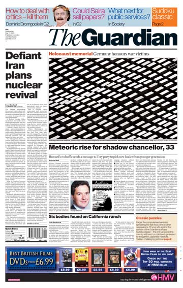
With color, and Miller.
Full image.
Now.
Full image.
Paul Barnes and Mark Porter at the ATypI last Saturday.
Full image.
Baltimore Sun type in late '90s and now.
 EVENTY-FIVE years after the development of Times Roman, there is a boomlet of new typefaces for newspapers. It seems that nowadays you can hardly redesign a paper without one. Custom fonts got going again in magazines in the early 90s, with Rolling Stone in 1977, and picked up steam with the advent of desktop publishing. Newspapers, lagged a few years behind, but by the mid-90s new typefaces were made for specific papers.
I take some of the credit, or blame. The 19th century workhorse of newsprint, Ionic, was put back in its traces at the Baltimore Sun at my behest. Wide, short and study, the style became popular in newspapers in the 1890s, derived from the weathered "modern" fonts which newspapers, stiffly derived from the elegan Bodonis and Didots of the previous turn-of-the-century. The papers literally wore out these moderns, and found that the Clarendons and Egyptians, with their thicker thins, lasted longer. Linotype consolidated the style in Ionic No. 5, which became the cornerstone of Chauncy Griffifth's Linotype Legibility Series, which grew to include Corona, Excelsior, Opticon, Paragon, and Textype.
I fell in love with Ionic when I was still in college, and it was still my favorite in 1972, when I used it for the text of LA, set on the Mergenthaler VIP phototypesetter. Interesting that Ionic worked for metal type and letterpress; it worked for phototype and offset; and it now works for digital type and direct-to-plate offset. The Legibility siblings are still in wide use. The New York Times is set in Intertype's old clone, Imperial. Poynter proclaimed in a 1989 newsletter that the experts had found Monotype's Nimrod (1980) to be the most readable typeface for newspapers.
Actually, that study of digital type for newspapers, which I helped organize, found that there is no best typeface for papers. You have to test a variety of fonts under local conditions. The variables of size, leading, tracking, and width have great influence in readability. Then, you should study the effect of imaging, plating, presswork and printing.
We found at Poynter that the digital versions of good old Times Roman or really old Modern No. 2, still worked quite well on letterpress, as did, surprisingly, Emigre's Matrix, a pop hit of the era.
Letterpress is gone. We don't see much Matrix any more. But Ionic is still here. I specified it also for the L.A. Times, and it seems perfect for that paper.
At the Rocky Mountain News, we used Ionic for text, and found that Matthew Carter had designed a brilliant Latin face (that is, one with trangular serifs) for El Pais, but the change was too much for the client, and the typeface was languishing, unpublished. The Rocky happily licensed it, and the font is now called Rocky, and will be released soon for Carter & Cone by the Font Bureau.
Ionic did not work as well for the Houston Chronicle, so Christian Schwartz tuned a Jenson revival perfectly for their presses. It matched his custom news headline font, and the Chronicle got good legibility and a stylish and unqiue look-and-feel,which increasingly is the goal of custom type design.
Saturday, 30 September 2006, at the ATypI conference in Lisbon, I showed some of this work.
One result of the Poynter effort was the typeface called Poynter developed at the Font Bureau. Another is the persistence of Nimrod, also helped along by its choice for the Guardian in 1988.
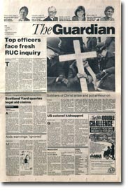
That was a startling redesign, done by Pentagram's David Hillman. The design probably saved the Guardian, by obiterating its truculant socialist image. Now it was New Labour, almost hip.
Hillman used Helvetica for the headlines, perhaps inspired by Neville Brody's proto-minimalist Arena magazine, or even by the wildly revolutionary Minneapolis Star, which featured Helvetica for text as well, and used line spaces between paragraphs, instead of indents.
Coming from outside the newsroom, like Massimo Vignelli, in The Herald, his shockingly modern, short-lived daily in New York daily (1971), Hillman forced onto the pages a horizontal grid, making subs cut text to fit, or else pad it out. (Vignelli, one of the few designers whose work is timeless, teased the ATypI audience in Lisbon the day before by asserting that he really has all the typefaces that he needs.)
Mark Porter, the top house designer inside the Guardian newsroom since that big change, and now creative director, steadily improved the design over the years. He chucked the Nimrod, replacing it with Matthew's Miller News, a cousin of the Miller Daily that Eduardo Danilo and I specked for the (Singapore) Straits Times around the same time. The Millers are also available from the Font Bureau, and were adapted by Matthew as the Windows system font, Georgia, in which this text is of course set. Miller is an elegant "transitional" precursor to the Ionics. Matthew went on to develop the Miller Headline that the Porter started using in the tabloid-sized section, G2.
But in 2004, the Guardian decided to dramatically reduce the size of the paper to "Berliner" size, 47 x 32 cm, to better compete with The Times and the Independent, which had gone tabloid. Porter felt that more than size had to be changed, to help the paper deal with the competition—particularly from the web. The news executives in London felt the pressure of circulation and advertising declines that are affecting newspapers all over the world.
The Guardian had played the Internet game very well. Neville Brody designed a brilliant web site, Guardian Unlimited. Yet, that was not enough. Porter wanted a complete typographical change, to signal the paper's currency and relevance just as strongly as the Hillman design had done in the '80s.
He called in Paul Barnes, who'd been an adviser during the previous round of typeface changes, and Barnes hired Christian Schwartz. (Disclosure: I worked with each of these guys at the beginning of their careers.)
Clearly, Porter wanted to make the same break with the old design as David Hillman had with the Old Labor. The Hillman legacy he thought had again begun to take on the dank odor of an old Manchester basement. Papers everywhere had changed, catching up with the design, and the Guardian had to break out of the pack.
He started with Gerard Unger's Gulliver, which had raised newsroom eyebrows when it was adopted by Richard Curtis at USA Today in 2000.
In Lisbon, Barnes and Schartz described a gruelingly long-run type development process. The Airbus 380 probably has had fewer design iterations. The team marched away from Gulliver, back through some Aster-like Old Styles, then did quite a great number variations to something they called "Hacienda," only to abandon it all all in favor of an updated slab, that looks, uh, a bit like Gulliver. But, that's not all. They ran up some 50 different weights, and then made an sans serif set as well.
What an effort! What a client!
The design got off the ground a year ago on schedule, unlike the great Euro double-decker, and to much designer applause (one of those fat pencils from the D&AD and "world's best-designed newspaper" award from the SND).
Porter said the editor's, Alan Russbridger's brief for the redesign was for something "modern" and "austere." He got both. But did he get the Guardian?
Does it make sense to to abandon the traditional forms of newspapers as much as possible, so that, for one thing, the younger generation doesn't attach the stigma they do to the traditional papers? Does it make sense to get rid of a modern classic (Helvetica) and a sweet 19th century revival type (Miller) and bet the farm on a contemporary, Unger-wannabe?
Moreover, does it make sense to move so far away from a successful typographic design? (The layouts and spacing are still quite reminiscent of the Hillman style.) Do readers have any feelings about these things? I think they do.
I personally miss the ATF News Gothic Condensed and particularly the Ludlow Bookman, that The New York Times threw out when it went to an all-Cheltenham-all-the-time format. (Using font designed by the same Matthew Carter.) I think the paper lost a bit of its grit.
Worse, why did the Baltimore Sun ditch Berlow's Old Romans? Sure they had already ruined the design I had done with John Goecke and Joe Hutchinson ten years back (which itself had gotten the SND best-dressed award). Something had to be done to clean it up, but why substitute a 21st century Modern and call it Mencken, when they already had a Mencken-era revival that worked quite well? Yeah, and why throw out good old Ionic No. 5 (which printed beautifully) in exchange for a new Nimrod look-alike, except to annoy the old art department—since the readers could probably not tell the difference?
Not that these are not good typefaces. Jean-François Porchez designed a fine, crisp modern headline face and a perfectly serviceable text type, just as he was commissioned. It's just that the equity of the old design was washed needlessly away. Maybe that's what Robert Lockwood thought when we threw out the Century Old Style that he had chosen in his design for the Sun, but he kept quiet.
David Hillman, a year ago, was not quiet. He said noisily in The Independent that the Guardian now looks like one of the free newspapers that have been littering the streets near subway stops in cities around the world. Well, it's a lot better than that. (Although I have to say, with similar rancor, that the free Baltimore Examiner looks more Baltimore than the new Sun.)
Sure, papers have to stop being boring. Their designs must appeal to young people, as well as to the increasingly distracted boomers and other old folks. But just as Chip Kidd makes books that look like books, I think there is value in making newspapers look like newspapers. If you don't like the pig, rouge does not help. Get a new pig; a dog won't do the job.
So, as good as this design is, and it has proved its quality every day for a year now, I miss the Helvetica. I miss the link with the previous 17 years. Of course, even I would have dropped the Nimrod, but maybe tried Matthew's excellent Olympian (1970).
As for the fonts, they too are beautiful. And at this rate the Guardian will be through with them by the year 2024, and we can all use them.
Your Thoughts (2 comments)
2006-10-12 by John Recht
Nice Work If You Can Get It
Roger, looking online at articles about your work, and reading your blog, I just have to smile when I think about how far we have come since The Maroon. Drop me an email sometime and let's catch up.
2008-01-09 by Sam Berlow
Old Roman? - Actually....
Roger great read. I was searching for John Goecke Design, and came back to this article from Google. Although I read it last year, like Hemingway or Fitzgerald, I figured I'd read it again. A correction. 'Old Roman' is referred to under the section describing the Baltimore Sun. The display family which was 'ditched' was actually called, Sun Display, it was expanded by Tages Anzieger and the Montreal Gazette and finally La Stampa. Currently used in over 15 newspapers worldwide (prerelease) The family will be released as FB Moderno 32 Styles: Light, regular, semibold, and bold in normal, condensed, extra condensed, and compressed widths all with italics.