A tale of two Times
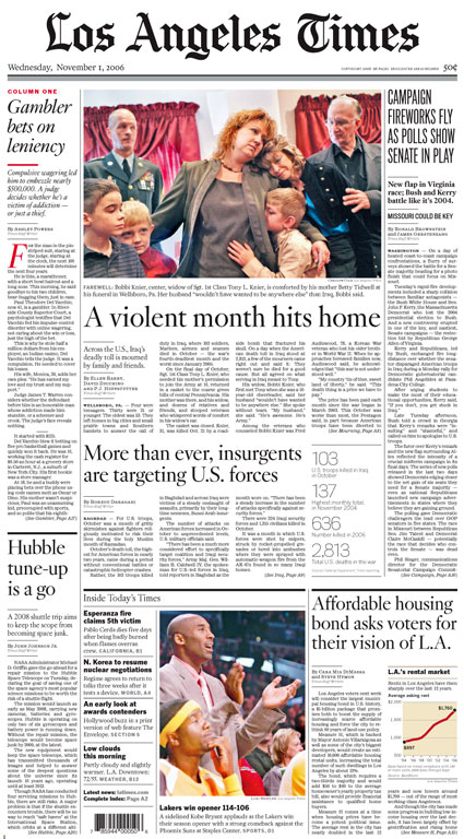
LA Times A1.
Full image.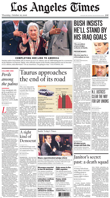
LA Times A1.
Full image.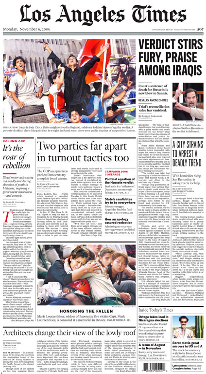
LA Times A1.
Full image.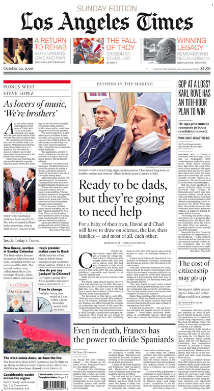
LA Times A1.
Full image.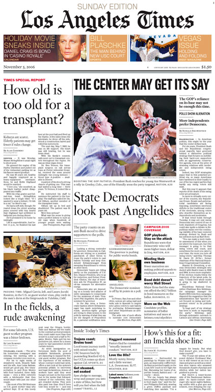
LA Times A1.
Full image.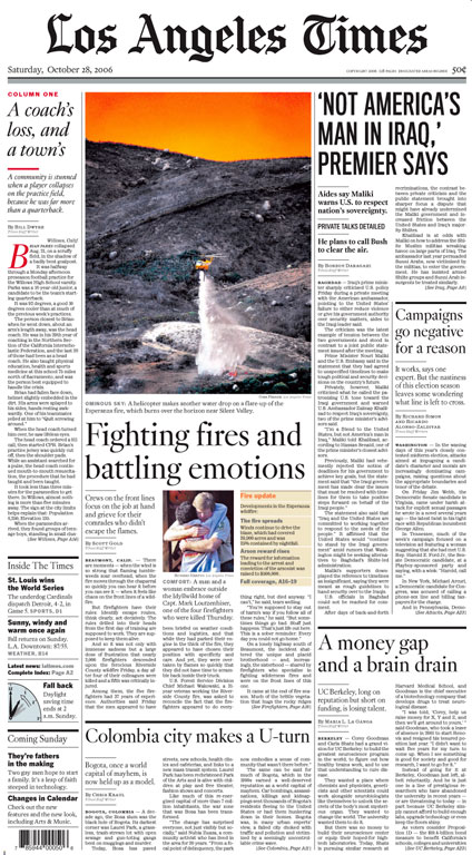
LA Times A1.
Full image.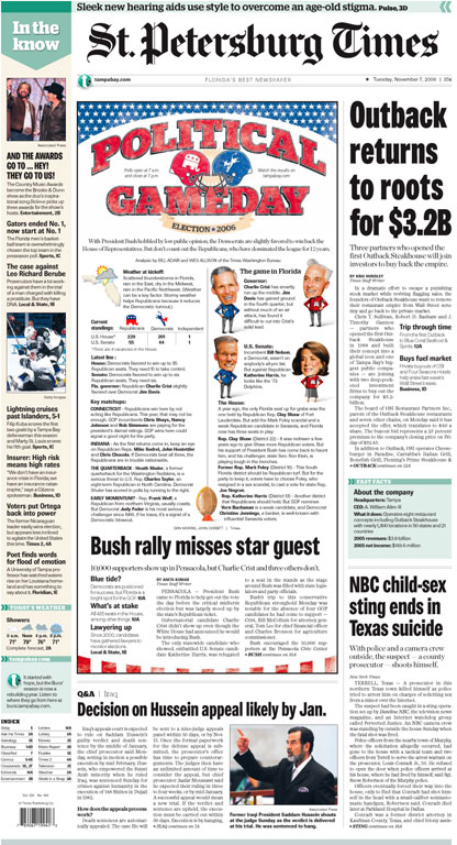
St. Pete A1.
Full image.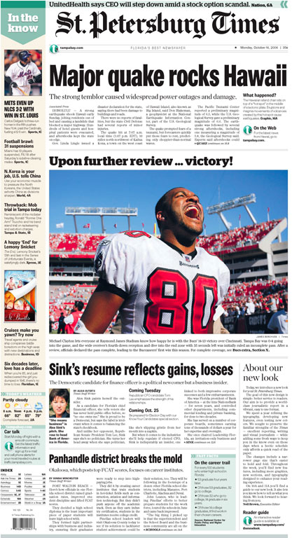
St. Pete A1.
 N OCTOBER, two big U.S. papers made some changes.The Los Angeles Times, under siege from its out-of-town owners, unveiled a redesigned front page and typography in the “A” section that at last matches the feature sections.
And, after a long delay, the St. Petersburg Times — now the biggest week-day paper in Florida — introduced a new design for the whole paper.
Of course, from across the street, both of them still look like newspapers, which Newsdesigner.com thinks, with no supporting evidence, is not the way to proceed. And so they may not do much for the people who don't want any part of these fiber-shedding, ink-smearing artifacts of the last century.
But, both have been fairly well-received. And some of us still think it's not a bad idea for a newspaper to look like a newspaper. Of course, it’s hard to judge a redesign until you’ve seen it work for at least a few months, which is why I don't like redesign competitions. Judging this stuff is more complicated than, say an Extreme Makeover reality show. A new newspaper design is a system, like a building. You have to use it for a while to know if it works for you.
From the first day, these two papers make an interesting comparison about redesigns.
[Disclosure: I have a dog in this race, having worked on the L.A. Times for some years.]
I’m delighted, at the very least, to see David Berlow’s Kis fonts appear in the main news section. This is a great revival of a great typeface.
The paper has suffered for over a decade with different sets of fonts in the news and feature sections. A design by Tom Trapnell in the early 90s, using Adobe Minion among other fonts, was accepted only for the feature sections. The news sections held onto a Times Roman headline adaptation ordered up by Sheila de Bretteville back in the 70s.
Thus, the headline style of the paper was split between a 70s Dutch and a 90s Old Style Revival, a little like putting bechamel sauce on house-label hot dogs. When I was brought in the first time (1999), I pushed to abandon the uncompleted Minion direction and base the design of the paper on better Kis (the 17th century Dutch typeface that set the style that gave us Caslon in the 18th century and Times Roman in the 20th). The idea was to stay within the familiar range of the de Bretteville design, but give it more inflection and elegance.
The concept was approved, but the great John Carroll — then editor — wanted to ease the redesign into the paper slowly, to give the readers and the newsroom time to get used to it. So, until now, they had another split personality. The news sections continued on with the up-style Times-manqué headlines. The feature sections had the down-style Kis. Joe Hutchinson dusted off the typography of news, sports and business, and changed the body type throughout the paper to the all-time standard, Ionic.
Interim moral: Gradual, more evolutionary change can lead to muddle.
On the same Sunday, on the other coast
Nelson Poynter's St. Petersburg Times, was, in the days before we even had SND, an innovative newspaper. Pushed along by the fast growth of the Tampa Bay area, Poynter kept upgrading the newsroom and the pressroom. There was an early use of color throughout the paper, and the headlines were set in Univers — or the Bitstream equivalent, Zurich. Many European designers would argue that Univers is the modern sans serif design, and Helvetica was just an accident. On this side of the Atlantic, Adrian Frutiger's font never quite caught on.
As an occasional resident of St. Pete Beach, I read the paper frequently, and it does a fine job, but the design was getting a little old. I was about to call up Marty Petty, a founder of SND and now second-in-command in St. Pete, and ask what the hell was going on, when I heard they were doing a redesign internally, led by art director Patty Cox.
The surprise was that there was no real surprise. The paper now is much better organized and somehow denser, which in an era of 100-item home pages, makes sense. We can all be happy that there is no home-page-inspired L-shaped page topper, unlike every other recent redesign. That thing wore out its welcome on the third day of the first paper that used it.
Instead, Patty and the St. Petersburg team used big green arrows at top left corners of the section openers. I have to say I hate green on newsprint. Something to do the with thin dyes in the thin ink they use combined with the gray newsrint. Purple is the second worst. Of course green is a primary color on screen, being the G in RGB. Maybe when the folks in St. Pete were designing the pages on the screen the brightness of the green pixels was appealing.
The arrows run the same branding risk as the L's. They come either annoying or invisible. Navigation aside, I would be reluctant to run a big content-free label every day next to the logo, "In the Know". They're well written blurbs, but isn’t "in the know" a conclusion that you should leave to the reader?
Bang for the buck
The real comparison of these redesigns is gradual vs. sudden implementation. Glacial or global warming. But while they moved faster in Florida, neither of these Times is revolutionary. Both stuck with the basic look-and-feel, the tone of their design personality.
Both changed headline typefaces. But if the L.A. Times had had a 30-year run with a font as distinguished as Univers, I would have kept it. I might have tried to improve the display drawings (since the Zurich used in St. Pete was one-size-fits-all), or I might have gone back to Adrian Frutiger for a Neuer Univers, but why chuck the design equity?
Not that Nick Shinn’s Brown Gothic is a bad typeface. Strangely drawn, perhaps, in an effort to make it less mechanical, but the point here is that it is more like a 19th century grotesque than a modern gothic. Why did St. Pete want to go retro, when its design equity was modern? And, if you combine Miller Text with a grot headline face, why add an up-to-the-minute slab instead of a warm old Egyptian? You can argue the merits of Christian Schwartz’s Stag, and I for one prefer the unusable Egyptian 505, but the set doesn't work together.
In a Mario Garcia-like metaphor, a letter writer to the St. Pete Times said that you don't want a salad bar of fonts. Of course some excitable flamer could ask, what in hell does Kis have to do with Egizio?
At the L.A. Times we replaced the text font, Paragon, which had served well in the letterpress era, with its stout precursor, Ionic No. 5. The paper had mixed Ionic and Dutch for 30 years, and the stylistic friction had faded. And, I figured, maybe the friction can add a bit of range to the style, a little old west to the cosmopolitan elegance of the new Kis. The Calendar section from the 60s had carried a Clarendon heading, so Egizio became the display fonts to go with the Ionic. Depending on what section you are in, the style can go more Ionic or more Kis. But at some point the fresh water text style meets the salt water display, and some might think the result brackish.
I love it though, and I can’t wait until they carry the design finally through all the sections. (California, Sports and Business are slated for early next year.) I love it because it seems very L.A.
The moral of the story: You can't implant DNA.
Your Thoughts (0 comments)
No comments yet!