Type as dogma
An enthusiastic crowd watch some “hands-on” stone-carving at the University of Brighton art school, where ATypI was held, 12-16 September 2007.
Full image.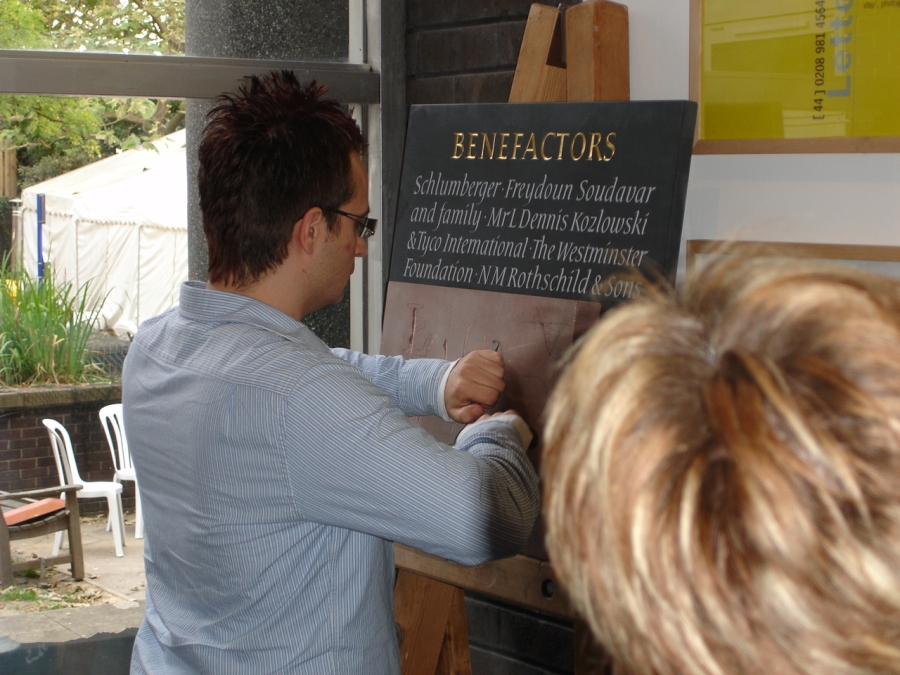
Type designer Adam Twardoch tries his hand at a lapidary inscrption.
Full image.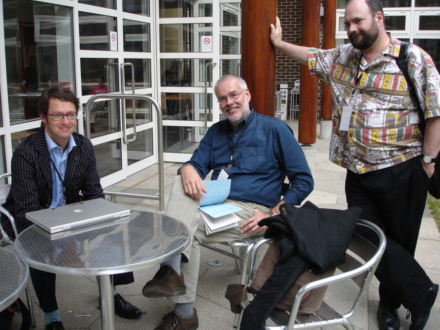
Outoing ATypI president, Paris type designer Jean-François Porchez, with the newly elected president, John Berry, a well-known writer on the graphic arts from Seattle, and Thomas Finney, an Adobe type adovcate based in Seattle.
 HIS PAST WEEKEND, the annual Association Typographique Internationale (ATypI) conference in Brighton screened the movie Helvetica. This is a fine documentary, directed by Gary Hustwit. It’s been shown at a few other conferences this year, and is now enjoying a small art house run. As one of those who hasn’t used Helvetica since 1970, I was prepared not to like it. But Helvetica, the movie, won me over — mostly by intercutting many striking shots of the typeface in use all over the world, for every possible purpose, and in every situation, from monumental corporate identity to graffiti-covered municipal notices.
The content is generated from a series of interviews with luminaries from the design conference circuit including Massimo Vignelli, a steadfast Helveticist, and Michael Beirut, whose wry comments about the corporate inevitability of the font cracked up the ATypI audience. Then the talk turned negative. Erik Spiekermann, typecast as the irascible aging wunderkind, inveighed against the font, as did Paula Scher. Their point was that the type is overused and not that legible, with the characters all drawn numbingly alike. Neither summoned the withering acidity that Paula directed at ITC Garamond in a legendary debate at the Type ’87 conference in New York.
At the end, some younger designers, like Michael C. Place and Stefan Sagmeister rallied around the typeface. They think of Helvetica as just part of the cultural atmosphere. They breathe it in, graffiti and all, and spit it out cheerfully, if randomly. The Helvetica establishment must cringe, but these Young Turks are the spiritual heirs of the Basle Gewerbeschule, of Wolfgang Weingart and the late great Dan Friedman.
Nobody in the movie really explained why the type has become universal, unless you agree that there is such a thing as a perfect typeface. Sumner Stone and other ATypI folks, chatting at the break afterwards, concluded that there was a lot of chance involved. Helvetica (and Times Roman) had become the standard fonts of the graphic design world in the 60s and 70s. When Xerox put the first fonts on laserprinters (1979?) those two were included. Later HP and Apple followed suit. The first Apple Laserwriter had both burned into ROM, using Adobe Postscript outlines. (The other two fonts were Symbol and Courier—the latter made of strokes, not outlines.)
The movie set up the ATypI conference well, suggesting that there are rival ideologies in type design, as well as generational styles and technological evolution. There is all of that.
At the beginning of the main conference another motion picture was shown, a documentary about Eric Gill by Luke Holland, Looking for Mr. Gill. This charming documentary is one of five by Holland about village life in Britain, made for the BBC. The director lives in Ditchling, not far from Brighton, a little town so cute that it’s a wonder they don’t make more movies there. Gill is invoked through the memories of the townspeople — an extraordinarily intelligent and articulate lot. Some of them relatives of his girlfriends or apprentices, living in the village and up the road in Ditchling Common — where Gill established a commune half a century before the hippies came along — and with somewhat wilder sex than I remember from the 60s. The whole idea of it stole the show.
Gill was a student of another Ditchlinger, Edward Johnston, whose landmark Writing, Illuminating and Lettering (1906) shifted the world of lettering and type design from Spencerian to Chancery. Gerald Fleuss showed how he created a calligraphy-based aesthetic cosmology that changed the thinking of D.B. Updike and Stanley Morison, powered the revival of Italian Renaissance in the 1920s (think, Centaur and Bembo), and continues on in the work of contemporary type designers such as Summer Stone, Robert Slimbach and Gerard Unger.
The Brighton ATypI came into focus around the importance of Johnston, not for his most-cited work, the proto-modern London Transport lettering, but for starting the movement which turned away from the expressive, commercial letterforms of the 18th and 19th centuries — all the delicious scripts, sweet moderns, hunky Egyptians and the early, gangly sans serifs. This was the Humanist revival, and God spare you if you got in its way. This kind orthodoxy led to the rigid theories of modernism (if not modernism itself), whose adherents enforce their own party-line Political Correctness, and have no more use for the eclectic clutter of the old type books as Johnston did.
The typographic link between Humanism and Modernism is Gill sans — a Humanist, geometric sans. It was only a short step from Gill to Futura. Helvetica, on the other hand, is really a grot — the original name was Neue Haas Grotesk — updated with horiziontal cut-offs. That post-war modernist graphic designers adopted Helvetica in lock step instead of, say, Syntax, may have been the first sign that the dogma of the religion was beginning to unravel.
Americans typically don’t approach design with either theory or ideology. So it was a great relief to hear James Mosely’s talk on “Vernacular Letters of the 18th Century.” Mosely was the longtime curator of St. Bride’s Library, London’s printing museum, and by carefully studying every bit of paper the St. Bride’s had collected and remembering it all. He is the world’s expert on the fantastic explosion of commercial lettering and type design that coincided with the Industrial Revoltion, both of which Britain led. He has not confined his interest to printing types, and has gone on to explore all the ways letters are used, from engraving to sign painting to stone carving.
In an earlier session, Mosely convincingly challenged some of Stone’s points in an interesting lecture about the development of the geometric monotone sans serif capitals in ancient times, and then again when William Caslon cast the first sans serif typeface in 1816. Stone suggested that Calson developed them as a logical simplification of classical models, much the way Johston did, Mosley pointed to lapidary examples in Greece, carved well before the Roman Empire came to be. Mosely has shown how London architects in the 18th century followed some of these early sans models on neo-classical buildings, several decades before Caslon’s “Egyptian.”
Their clash was a small token of the schism between the Spencerian and Chancery camps.
Mosely, in his own talk, had nothing negative to say about Johnston or the hegemony of the broad-nibbed pen in the 20th century. Rather he showed that if a little more knowledge of letterform history had been applied to some famous historical restoration projects in Britain, the results would have been more correct, strong and satisfying.
Most memorable is the number on the door of No. 10 Downing St. If you look at photographs of that door in Churchill’s time, there was a fat little 10 — robust “modern” numerals probably dating back to the Edwardian style that was popular when the door was first painted.
But when the house was rebuilt after the War, the Ministry of Works re-painted a rather weaker number, with the strokes stressed at the angle of Imperial Rome rather than Imperial Britain.
Why?
Edward Johnston.
Your Thoughts (2 comments)
2007-09-20 by Christopher Curtis Smith
Trade
Good ideas spread without trend. Helvetica is just too damn good to sneer at. Who needs flare when you have demonstrable clarity? Regardless of history, the H bomb is probably the most democratized typeface ever. The people's typeface, as it were.
2007-09-20 by Christopher Curtis Smith
Shit
I meant to write about Trade Gothic instead. Why are we talking about Helvetica again?