Requiem for a candidate
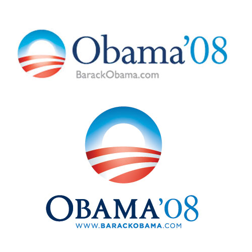
Obama's logo early in the campaign (above) and his current logo.
Full image.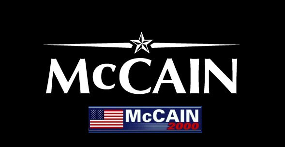
McCain's current logo (top) compared with his 2000 brand.
Full image.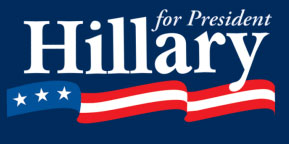
Hillary's 2008 logo.
 S BARACK OBAMA joining the establishment, now that he’s changed his logo from upper-and-lower to caps-and-small caps? I haven’t heard anyone make this charge, but there has been a lot of talk about the branding of the candidates.
Early in the year Sam Berlow and Cyrus Highsmith (of the Font Bureau) did an entertaining piece in the Boston Globe about what type styles say about the presidential candidates who are using them. Some of the worst examples were for people like Huckabee, who have quit the race. (Bad design makes you lose.)
As is the way with the media, the blogs picked up this discussion, and the phone at the Font Bureau started ringing. Sam did an entertaining interview with NPR, in which he described the Optima logo of McCain, as “one that can talk to Feingold and can talk to Bob Dole at the same time.”
A few weeks later Jessica Bennett from Newsweek was doing another piece, and contacted me for a web-video interview, in which I did okay on, although it hasn’t become a big hit on YouTube. Then CNN called and I did a very quick interview with Campbell Brown on “Election Center.” and paraphrased Sam by calling the McCain logo a Mmugwump’s choice.
Barack Obama has made the best use of branding since Ronald Reagan, and, as Michael Beirut noted in the Newsweek blog, Stumper by Andrew Romano, Obama has an unprecedented consistency in design. “I know what it takes to have rally after rally without someone saying, ‘Oh, we ran out of signs, let’s do a batch in AArial.’ It just doesn’t seem to happen. There’s an absolute level of control that I have trouble achieving with my corporate clients.”
Designers tend to favor Obama, and that, itself, is interesting. It’s like Apple. Designers like people who like design, and as Apple has shown with the iPod and the iPhone, it’s not just the designers. The market for good design is improving. You see that with Target. You see it with Audi. Good design is beginning to sell.
Obama recently changed his logotype, from Perpetua upper-and-lower, to Requiem, redrawn to reduce the weight slightly and to clip the serifs. This must have made Jonathan Hoefler happy, since his foundry also released Gotham, which Obama uses for the slogans on posters, and for the labels on his web site.
On his own blog, Jonathan did a funny send up of the Hillary and McCain logos, pointing out that McCain’s Optima is in frequent use in the packages of cheap cosmetics (probably in imitation of Estee Lauder). I didn’t get time to mention on CNN that the typeface also happens to be German, which I doubt the old solider knew when he picked it.
McCain probably did not spend much time on the decision. Somebody showed him a sketch, he saw the general’s star, and he said okay. From the look of his suits, the senator doesn’t put much stock in appearances, and he probably doesn’t like the word, “branding.”
But Hillary and Obama know all about suits. Hillary’s team, I imagine, carefully, even laboriously, developed her logo, starting with using her first name. From the looks of the bold, condensed Baskerville, that logo got redrawn a few times. But the flag swoosh makes that purposeful persistent (relentless?) logo look insecure.
Obama famously tossed his flag lapel pin, so relaxed and confident is he, and the red stripes in his “O” mark (sunrise over a plowed field?) shows a much more sophisticated command of design in politics than we have seen before. In the old days, a Democrat's only concern with a campaign poster was whether it had the printer’s union bug on it. But Obama’s graphics are, as Beirut noted, surprisingly consistent and effective. (No one has mentioned that Hitler had bold, effective and highly consistent graphics, too.)
The Obama camp, having established real momentum in the visual brand, has encouraged designers and artists to join in. The best example is Shepherd Fairey’s stunning “HOPE” poster. A Google image search for “Obama poster” yields dozens more, not all with the approved Gotham font.
It”s hard to build community and retain control, but it’s working so far. I am not, however, sure about the new logo. It seems a little too formal for this campaign. The upper-and-lower was more friendly and open. And now we are beginning to see the O-mark rendered in 3-D, like a NFL team button on the ESPN site. And there are scary glows behind the Barack pictures on the home page. This tweaking is getting too slick for Obama. The Gotham worked because it reminds us a bit of the wood type on the old Kennedy posters. These visual brands must project a sense of authenticity.
Today’s voters may respond to all the design effort by a candidate, but if it gets too slick it stops looking real.
Your Thoughts (0 comments)
No comments yet!