Screen Fonts: An Abbr. Hist.
Illustration 1.
Full image.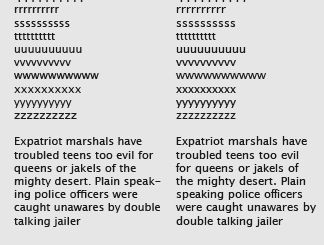
Illustration 2.
Full image.
Illustration 3a.
Full image.
Illustration 3b.
Full image.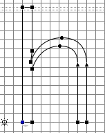
Illustration 3c.
Full image.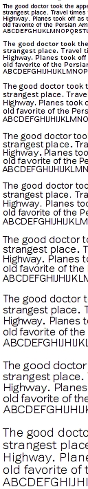
Illustration 4.
Full image.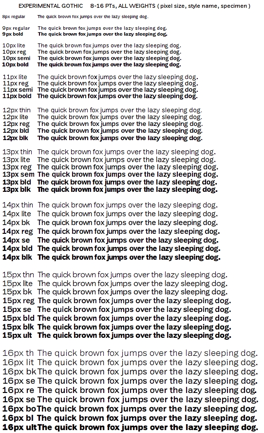
Illustration 5.
Full image.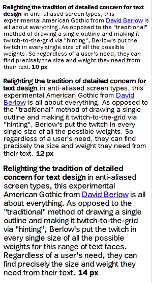
Illustration 6.
Full image.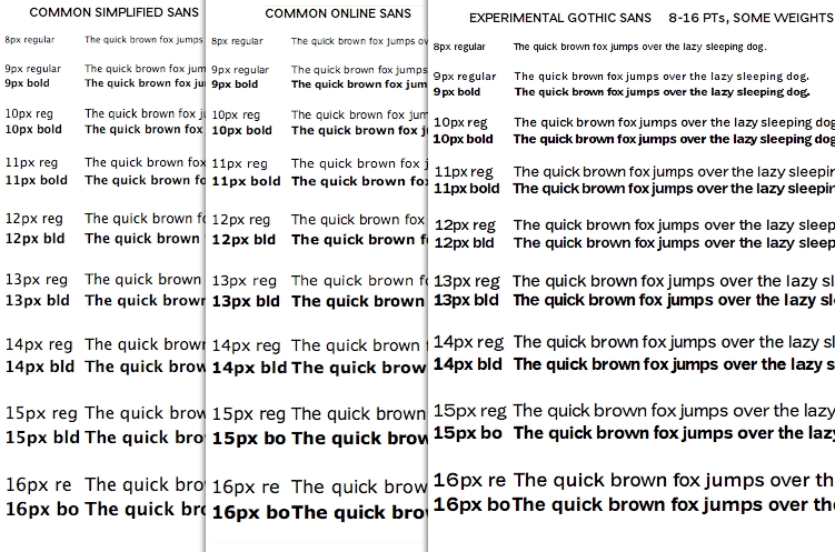
Illustration 7.
 HE TEXT ON this site has caused a certain amount of heat, and I wanted to get my partner at the Font Bureau, David Berlow’s thoughts on the direction of screen fonts. We’ve been hearing about ClearType, and CoolType and other things, but the type on the web sites seems largely to have stayed the same thing, with the only thing improving is the displays. I should not have been surprised that David was not only thinking, but working on this problem, and with this entry, he brings us up to date.
* * *
The history of screen fonts is also the history of electronic authoring, design and publishing on computers. For over 30 years, from early electronic publishing, to the Internet of publishing today, screen fonts have proved of growing concern to users and publishers. What’s good? Or more appropriately: What are good options that should be available to users? Or to “Our” users?
Personal computers began with aliased screen fonts, otherwise known as black and white, or just plain bitmaps. In the mid-90’s Adobe introduced a version of Adobe Type Manager which produced anti-aliased type. Then in 1999, as Apple released its tenth operating system, anti-aliased type came to the Mac. Microsoft announced its own anti-aliased type rendering in 1999, then included various anti-aliasing options in Windows starting in 2002, and now, Microsoft’s most recent OS release contains anti-aliased type by default and a collection of fonts made especially for the purpose.
The major operating systems use anti-aliased fonts now, and the aliased, (black and white font), is reserved mostly for small sizes. On the Macintosh, the user can choose which size to stop anti-aliasing in the appearance preferences. On Windows, within the font itself is a table of information that tells the OS which to render (b&w or anti-aliased) at any given size. And on a related side of the issue’s history—resolution on personal computer screens has increased from 40-50 pixels per inch (ppi), to 72 or 96 ppi, with some new screens in the 144 to 216 ppi range. With this, there are a lot more possibilities stylistically, and qualitatively for anti-aliased type that black and white or lower resolution could not offer the user.
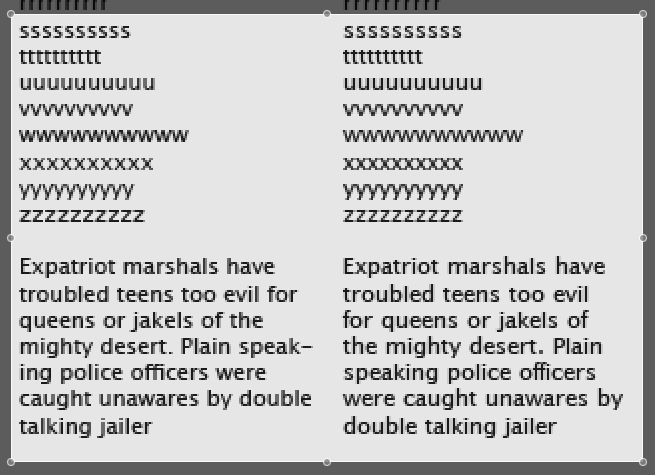
Personally, I decided there was something seriously amiss when I noted with some surprise that the fonts on my iPod had surpassed the quality of the fonts in iTunes, which only allows type style in "small" or "large". So, as the options are per OS, application program, resolution, screen species, and user preferences, the first study is of a single size of the font my system calls Lucida Grande (ill. 1).
Screen Fonts: A Fresh Start
The study began as the simplest test: On the left side is the outline font, Lucida Grande rendered on the Mac at 11 pixels per em. The color of the text looks even, and nothing seems to jump out. If you look at the strings of letters above, you see that the letters, t and u quite obviously, do not repeat. Looking at that text again, you can see it has little or no structure to impress the eye. On the right (still ill. 1), is another version of that outline adjusted in two ways. First, the width of each character is made to fall exactly on a pixel boundary. This done to all characters, all characters will repeat exactly at this size. Second, the outline of each character is adjusted relative to the movement of the width, until the image and all of its adjacency issues are resolved.
When this image is viewed at 100%, (ill. 2), the difference becomes more apparent. It is not judged to be superior or inferior, but simply an option that this user wished to explore, and could. By exploring and demonstrating a difference on a design that I consider amongst the simplest forms of sans, it follows that more complex designs would benefit more apparently from this treatment.
In another area of work, I had been preparing display versions of a wide range of Franklin, gothic styles of more complexity. In the course of beginning the text versions of the same family, I drew an agate version. This became the source to begin the drawing of 9 fonts, (ill. 3 a, b and c) each of the possible pixel per em sizes for a thinly weighted sans from 8 to 16 pixels (ill. 4). In the course of considering the problem of screen text, I’ve encountered enough variables in user taste (beside the style of type, just the weight), and difference is screen images to understand that a single weight is not enough to satisfy many users.
So, all of the appropriate weights for text use at each of these nine sizes was then drawn (ill. 5). You can quite easily see in the specimens (on a Mac only, sorry), that the weight from thinnest to boldest of each size does not vary the length of the sample line appreciably. This was decided to contain the spacing within that originally given to the thinnest weight. A total of 46 digital outline fonts of the 96 basic ASCII glyphs were “fit” to the grid of pixels and represent a selection of weights one might want for reading, writing, browsing of text, for use in captions, pull quotes, buttons and many other examples of small uses for type (ill. 6).
A standard “American Gothic” style was drawn, as it is one that is familiar to most American readers. In comparison to simplified sans forms this Gothic, has terminals ending in more complex and perhaps more easily distinguished forms, all of which is an issue pointing to further study (ill. 7). For this study, a middle-ground of complexity in that particular area was chosen, drawn and varied to the possible weights so that users will find the best font for their needs, regardless of size, or color of type and background, on the Mac, with the properly set appearance menu (choose Quartz rendering to 6 pt.).
Screen Fonts: Technical Schmecnical
These things: variety of contrast and weight at a range of sizes, consistent spacing and type for a variety of backgrounds and colors, can be accomplished as a user’s option to the default behavior of fonts on the Mac.
Providing quality anti-aliased fonts on the Mac is a bigger challenge because the Mac OS, via the appearance menu, turns off hints when anti-aliasing is turned on. This brings the need for multiple outlines to accomplish what’s shown here. On Windows, and in Linux, where hints are effective at whatever size the type designer decides, a solution is possible that could be contained in a single outline, without using any patented TT hinting, as required for Linux. But two more design areas that need to be fleshed out, an “old style” Roman, and a long-reading italic.
Note: While the illustrations are shown at full quality, they are nonetheless JPEG images, and thus compression is inherent.
Your Thoughts (2 comments)
2007-02-03 by Si
Some corrections
Sigh, the dates are posted here… http://www.microsoft.com/typography/ClearTypeInfo.mspx >Microsoft announced its own anti-aliased type rendering in 1999, A reference to ClearType? That was November 1998. Apple, Adobe, Bitstream and others worked out the basics of how it worked and various people took similar techniques to market ahead of the Microsoft’s first productization of the technology in the Microsoft Reader (eBook reader) which shipped in April 2000. >then included various anti-aliasing options in Windows starting in 2002, Windows XP? No that was October 2001. However, Windows 95 supported traditional anti-aliasing - the feature known as 'font smoothing' which, much like Mac OS, kicks in at larger sizes, or smaller sizes when the font asks for it. Although an accurate timeline might show Microsoft as the innovator here, you could always throw in a reference to Acorn, the obscure UK based computer maker that had a completely fuzzy rendering model as early as 1976 (by some accounts). ;-) Anyway, apart from that – a great article!
2007-02-05 by Berlow
Thanks Si
Just to be clear, Simon Danials is the type guy at Microsoft. Thanks for the detailed timeline corrections, and I'm glad you liked it overall. My interests, really, are when each particular anti-aliasing technology was branded, and then, when it became open to the public. I.E. when anyone could make fonts.I should've made that more clear...Cheers!