A conversation with
Luke Hayman
New York Magazine.
Full image.
New York Magazine.
Full image.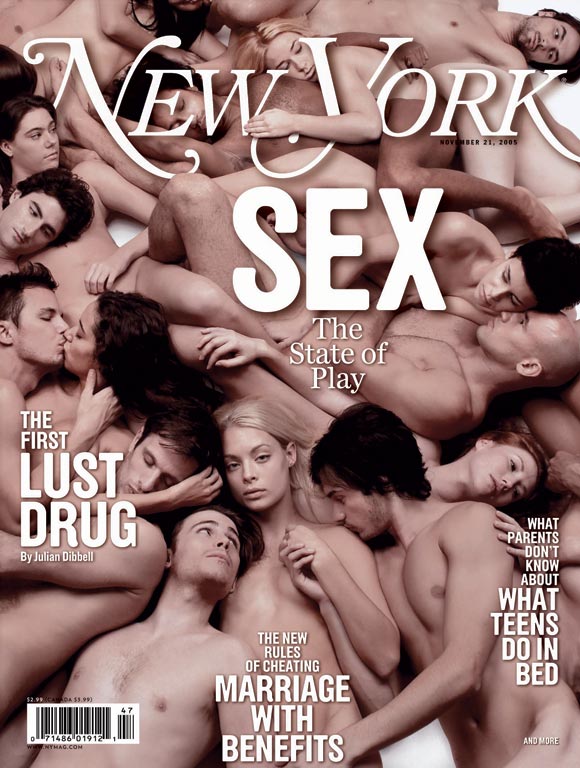
New York Magazine.
Full image.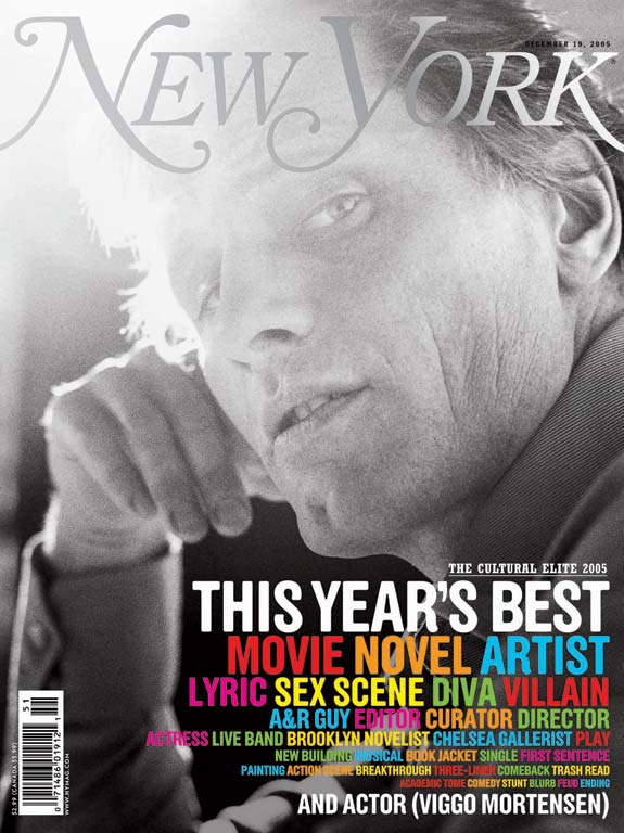
New York Magazine.
Full image.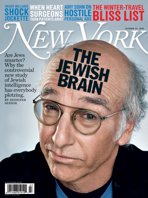
New York Magazine.
Full image.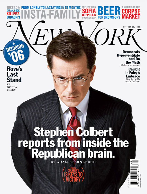
New York Magazine.
Full image.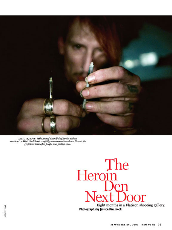
New York Magazine.
Full image.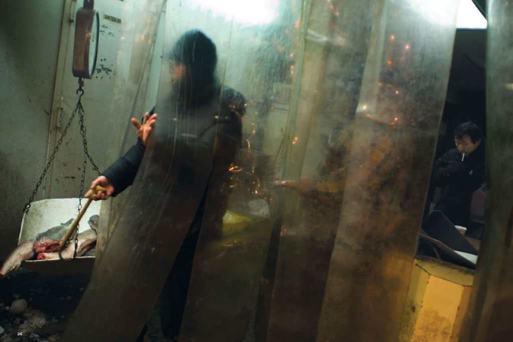
New York Magazine.
Full image.
New York Magazine.
Full image.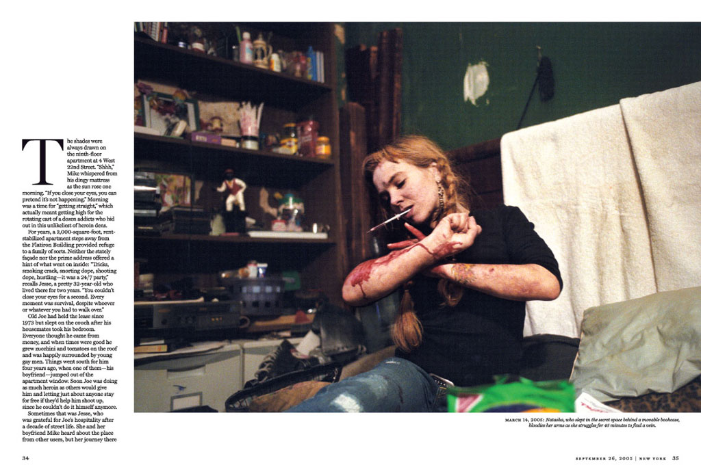
New York Magazine.
Full image.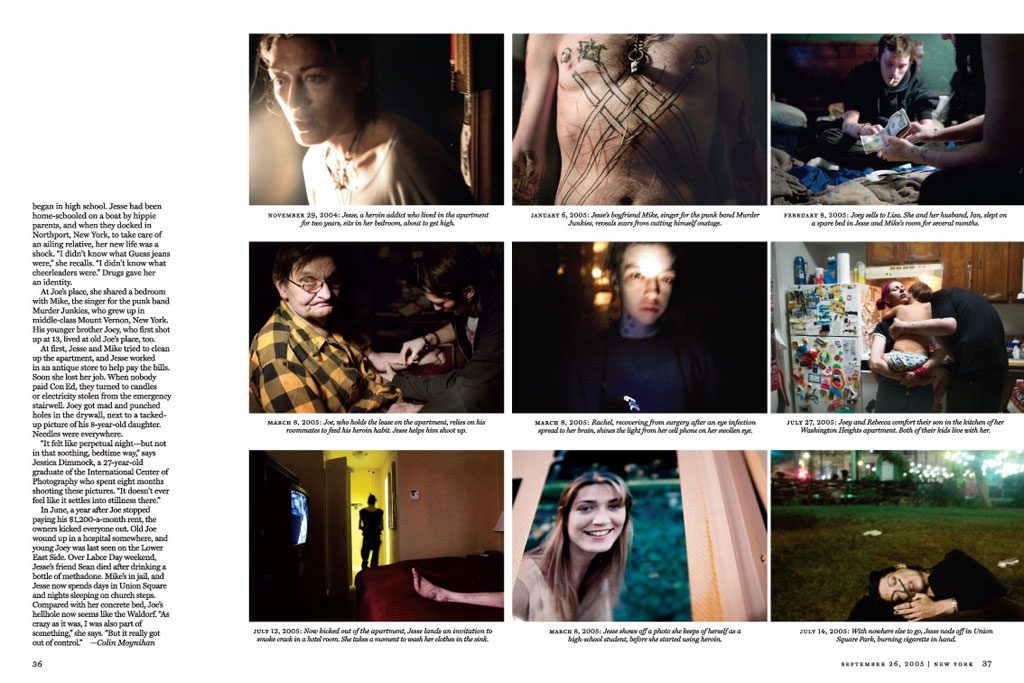
New York Magazine.
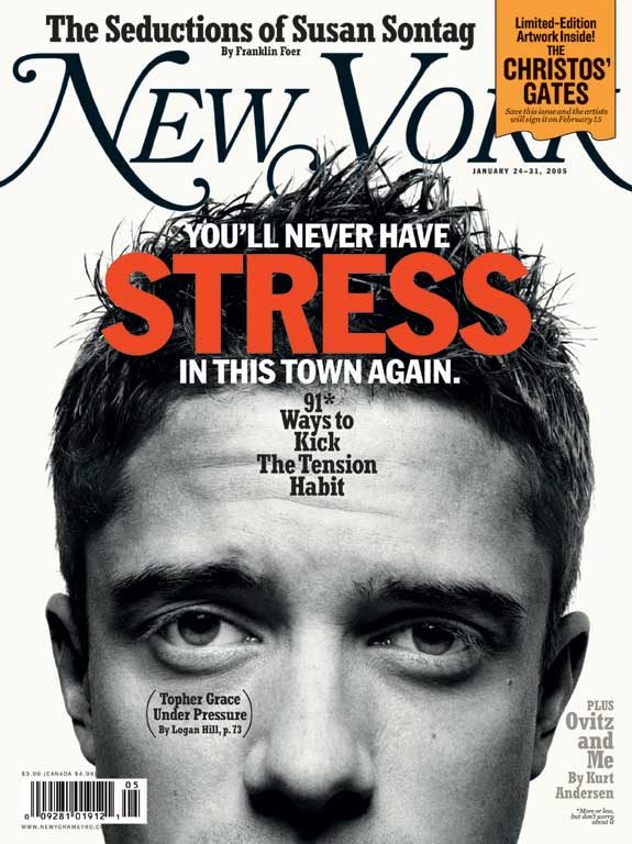
 VER THE PAST couple of years I’ve become increasingly aware of the
work of Luke Hayman, until recently the design director of New York
magazine. (Isn’t it refreshing that the title was not “creative
director”?) The magazine, with editor Adam Moss, has again become New
York’s essential survival guide, and the visual side got better and
better.
VER THE PAST couple of years I’ve become increasingly aware of the
work of Luke Hayman, until recently the design director of New York
magazine. (Isn’t it refreshing that the title was not “creative
director”?) The magazine, with editor Adam Moss, has again become New
York’s essential survival guide, and the visual side got better and
better.
The design of New York seems to have some DNA traces from Palazzo, Glaser and Barnard. How conscious have you been to pick up on the magazine’s fabled origins? . . . Do you think a magazine should contain some visual reminders of its past (Vide: Rollling Stone, Esquire)?
Acknowledging the Glaser/Bernard design was firmly in the brief and was part of the first conversation with the new editor Adam Moss. Adam talks passionately about the early years of the magazine and he wanted to evoke the original without copying it. The way rules are used, the condensed Egyptian, some of the illustration styles are informed by the 1970’s era design.
In general, I think magazines should evolve rather than reinvent—but that assumes thoughtful, original and relevant design decisions were made in the first place! Vibe, Rolling Stone and Esquire all have superb design pedigrees.
It’s important to make something distinct and ownable. The New York magazine logo, for instance, is a crazy rococo creation but had to be embraced because it marks us so clearly and belongs to no one else.
Of course there are exceptions: twice in the last 13 years The Guardian newspaper in London has totally thrown out the baby with the bathwater but has managed to come back stronger both times. Remarkable.
What about this new Benguiat logo? Milton took Palazzo’s Caslon-out-of the-can, and heavied it up, almost made it a Bookman. You first went back to real Caslon, then got Ed to make it lighter. Was that so that you could see through it—to the cover picture—or what?
Two years ago we worked on a version of the Glaser logo for several weeks with Ed Benguiat. While this was going on we were working with a scan from the first issue as a placeholder. When we started using the new design we missed the placeholder so asked Ed to quickly draw up the original.
A few weeks ago we decided to try a lighter version. The problem we found was the enlarged the logo (it bleeds left and right) was taking up almost a quarter of the cover. This had been proposed by Paula Scher at Pentagram who Adam had brought in to consult on the covers during his first weeks.
I love the new version even though it has less presence on the newsstand.
The front of the book now most resembles the original magazine. But there are four sections with different personalities—front, features, reviews and listings—with the listings in the back more articulated, and with tinier agate type than most. The sections each have a distinct look. What are you thinking about how they work together? Are they supposed to create mood shifts as the reader goes through the magazine?
The challenge with this magazine is that it is actually several magazines . . . a listings magazine, a culture magazine and a city service magazine on top of the news and gossip and longer stories. Most publications a have a narrower scope.
The listings at the back—well, we just crammed in as much as possible to give space to other sections. At the same time we plug our website which is a better vehicle for this kind of information.
The Culture pages are a smart take on the cultural happenings of the city and allows for good art if we have it and provides a good vehicle for the critics to write at length if necessary.
Then the Strategist section is . . . (here’s quote from our introduction a couple of years ago) . . . “an upscale/downtown multipurpose tool for extracting the maximum amount of service from the city. A week of New York made simpler, and much more fun.” It’s the service section with shopping, food, restaurants, advice done with originality and passion.
And the features are what they are. It’s the one opportunity for us to break format and show that we’re not just churning out content to plug into formatted boxes. . . .
But hopefully everything hangs together. We try to stay disciplined and use the same fonts and grids and typographic tone on all of these sections where ever possible.
The features are often long, by current standards. There are real stories—and some picture stories as well. How do you art direct photographer to get a sense of narrative . . .
Unfortunately the design director doesn’t get much of a chance to art direct photography at a weekly like this one—there’s not enough time. I’ll go on an occasional cover shoot and the design department is involved in discussions of concepts, tone and the choice of photographer but the photo editors ultimately make the call and manage production.
Some of our larger photo essays have been commissioned, and some are existing projects that we publish. For instance we commissioned Benjamin Lowy to shoot the last days of the Fulton Fish market. We came across, and ran, an amazing project by Jessica Dimmock who’d spent 9 months with a group of heroin addicts in a Flatiron shooting gallery.
Can illustration come back to magazines with the kind of force of the art in the early New York magazine?
I don’t think so. For most stories photography—if you have it—is the best way to go—it’s simply more immediate. We’ve tried, with mixed results, a couple of narrative illustrated features (in the vein of James McMullen etc.), but it’s not a regular thing. The other tool we have and love, is photo-illustration where we get the best of both worlds: the control plus the illusion of reality. That’s fun!
What about covers? Sometimes there are Best Doctors covers, sometimes rather enigmatic photo illustrations about popular culture? What was the plan?
The covers, like the rest of the magazine, need to be different things to different audiences week by week. A fashion cover, followed by politics, celebrity, business, then food . . . it’s hard to hang this all together. The one thing that could unify all this is the point of view, the tone of voice, that knowing New York attitude—a bit clever, a dose of humor. . . . It’s subtle stuff and easy to get wrong!
At this point in this round of Q&A’s, it was announced that you are leaving New York to go to Pentagram, where you will work with the great Paula Scher on a redesign of Time. What do you think it will be like, working as a strategist at MacDill AFB rather than as a field commander in Iraq?
I like to think we’re the Peace Corps . . . :)
Pentagram is an amazing opportunity for me because I get to work within several feet of some extremely talented and intelligent designers. I’ve always tried to work with great people and on great projects.
It’s been inspiring working with Paula. I sit next to Abbott Miller—one of my mentors. (I worked for him at Design Writing Research several years ago). I could go on.
And I love variety: editorial design is my passion but I also crave exhibition design, identity, new media and any other kind of design I’ve never done before.
Any parting advice for the next art director of New York?
Well . . . it’s a tough gig. Weeklies are exhilarating when things are going well but hell when they’re not! Our success came from hiring the best designers and then letting them do their job. We were a very close team, always discussing direction and tone and our particular design language. But at the end of the (long) day they ran their own sections and I’d get involved only if new parts were being developed or if problems arose. It’s tempting to hire people who won’t threaten or challenge you, but as David Ogilvy once said - “If you always hire people who are smaller than you are, we shall become a company of dwarfs. If, on the other hand, you always hire people who are bigger than you are, we shall become a company of giants.”
Your Thoughts (0 comments)
No comments yet!